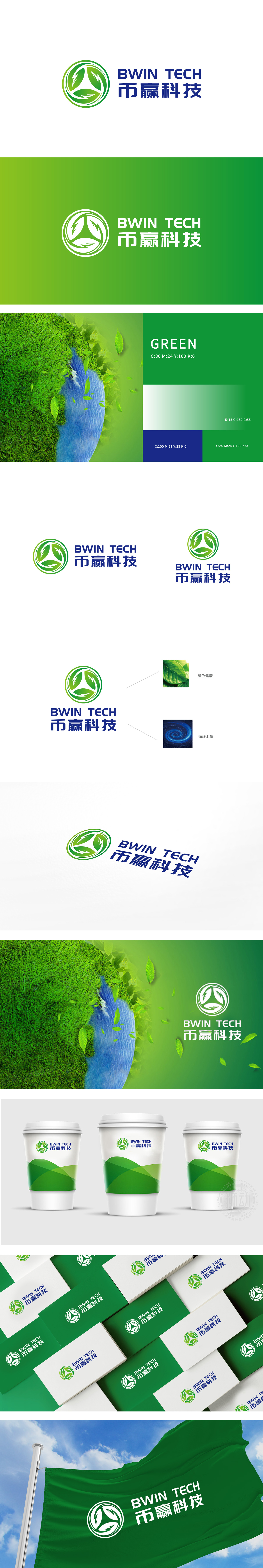
狮动设计采用绿色的循环叶片+箭头组合:绿色作为环保的核心色,瞬间关联“生态、可持续”;三片叶子以循环轨迹排列,像植物的生长周期,又像能量的流动方向,“三角形”的稳定结构,既平衡了视觉,也暗合科技公司“可靠、专业”的属性——环保不是口号,是可落地的科技支撑。 这种“抽象+象征”的设计,把环保理念“藏”在每一个视觉元素里,让观众在看到的瞬间,就能感受到品牌“用科技推动环保”的核心主张。
Lion design adopts the combination of green circulating blades and arrows: green is the core color of environmental protection, which is instantly associated with "ecology and sustainability"; The three leaves are arranged in a circular trajectory, like the growth cycle of plants and the flow direction of energy. The stable structure of "triangle" not only balances the vision, but also coincides with the "reliable and professional" attribute of technology companies-environmental protection is not a slogan, but a scientific support that can be landed.


扫码或拨打添加客服微信


