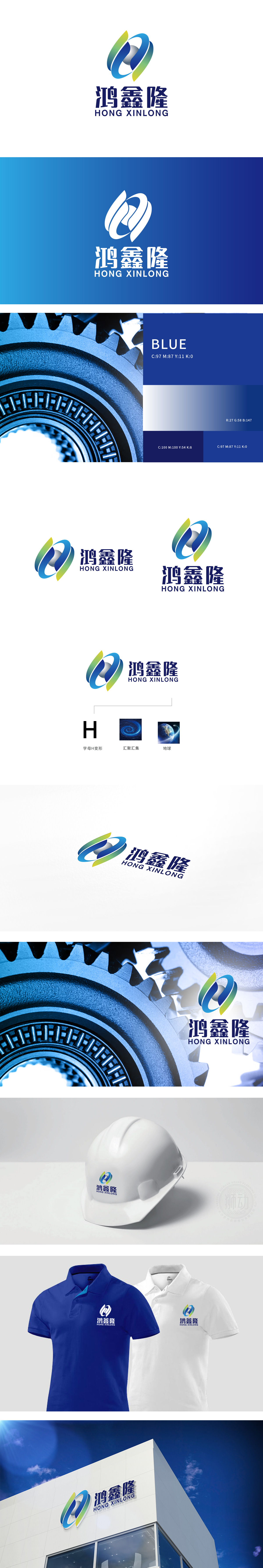
狮动设计以品牌首字母“H”为设计原点,通过“交错环绕”的变形手法,转化为具有动感的螺旋结构:左侧曲线从蓝色渐变至绿色,右侧曲线从蓝色渐变至黄色,两条曲线相互缠绕、形成闭环,既保留了H的“对称感”与“识别性”,赋予标志生长性”与“连接性”,暗合“鸿鑫隆”中“鸿”(宏大)、“鑫”(多金、汇聚)的品牌调性。整体设计以首字母为根,以汇聚为核,以全球为界,传递“鸿图大展、鑫聚天下、隆盛全球”的品牌愿景。
Lion Design takes the brand initials "H" as the design origin, and it is transformed into a dynamic spiral structure through the deformation method of "crisscross": the left curve gradually changes from blue to green, and the right curve gradually changes from blue to yellow, and the two curves are intertwined to form a closed loop, which not only retains the sense of symmetry and recognition of H, but also endows the logo with growth and connectivity, which coincides with Hongxin. The overall design takes the initials as the root, convergence as the core, and the world as the boundary, and conveys the brand vision of "Hongtu Exhibition, Xin Ju Tian Xia, Longsheng Global".


扫码或拨打添加客服微信


