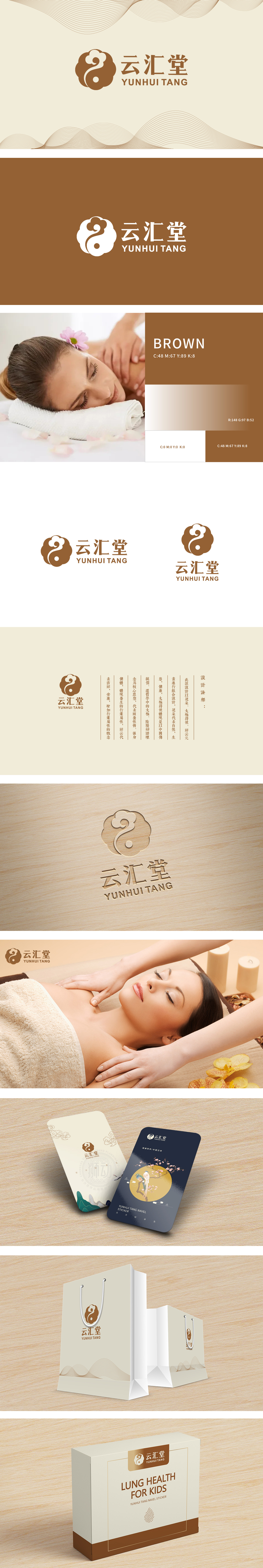
狮动设计以“太极+祥云”为核心——太极是中国传统哲学的“健康图腾”,阴阳平衡的逻辑正好对应保健品“调理身心、追求平衡”的本质;祥云卷动的线条像一团“温柔的祝福”,直接关联“吉祥、安康”的用户期待,看一眼就懂:这是个“能给人安心感的健康品牌”。花朵代表“自然与生命”,暗合保健品“天然成分、源于自然”的卖点;太极符号作为“中国养生文化的IP”,瞬间唤醒用户对“太极养生、传统强身”的认知;祥云元则像一根“线”,把这些元素串成一个整体,视觉上统一又有层次感,连细节都在说“我们的设计是有逻辑的”,每一个元素都在说“我懂你想要的健康”。
The lion dance design takes "Tai Chi+Xiangyun" as the core-Tai Chi is the "healthy totem" of China's traditional philosophy, and the logic of yin and yang balance just corresponds to the essence of health care products "regulating body and mind and pursuing balance"; Xiangyun's rolling lines are like a group of "gentle blessings", which are directly related to the expectations of users who are "auspicious and healthy". At a glance, you can understand that this is a "healthy brand that can give people a sense of peace of mind".Flowers represent "nature and life".
.


扫码或拨打添加客服微信


