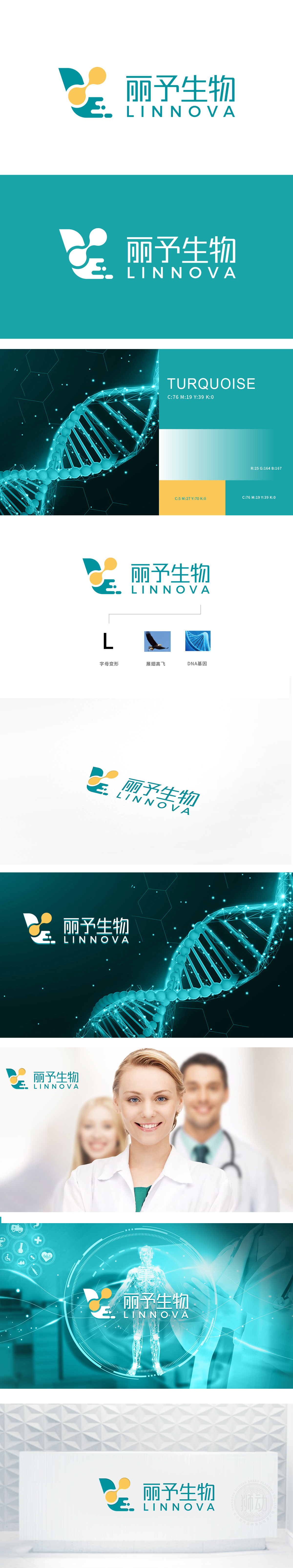
狮动设计将“L”(首字母)抽象变形——以翅膀状的曲线为基底,既保留了字母的识别性,又通过“翅膀”的隐喻传递“守护生命、赋能健康”的品牌使命;上方两个黄色圆形,似细胞、似分子,既呼应生物科技“从微观到宏观”的研究逻辑,又增添了活力感,打破了传统医疗品牌的严肃感。这种“字母+意象”的变形设计,既强化了品牌的专属感,又用图形语言说了“品牌想说的话”。整体以“品牌基因+行业属性”为核心逻辑,将生物科技与医疗器械的专业感、品牌的温度感完美融合,每一处细节都透露出对设计的极致把控,让人不得不佩服其设计能力。
Lion Design abstractly distorts the "L" (initials)-based on the wing-shaped curve, which not only retains the recognition of letters, but also conveys the brand mission of "protecting life and empowering health" through the metaphor of "wings"; The two yellow circles above, like cells and molecules, not only echo the research logic of biotechnology from micro to macro, but also add a sense of vitality and break the seriousness of traditional medical brands. This "letter+image" deformation design not only strengthens the brand's sense of exclusivity, but also says "what the brand wants to say" in graphic language.


扫码或拨打添加客服微信


