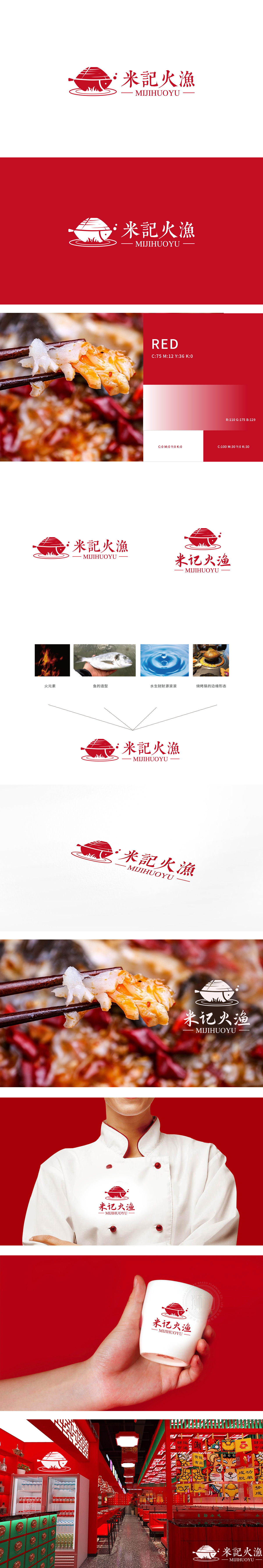
狮动设计将锅体简化为船型,通过“船”的形态传递出“承载美食”的场景感,鱼的造型,清晰传递出“以鱼为核心食材”的餐饮定位;同时,鱼形与船型的组合,形成“锅中有鱼”的直观联想,强化了“烤鱼/煮鱼”的烹饪场景。水纹,是“水生财”元素的视觉转化,主色调为红色,是“火元素”的间接体现。红色本身具有“热情、火热、活力”的联想,红色在餐饮行业中能激发食欲,“米記火漁”的LOGO通过**“元素提炼—符号转化—场景融合”**的设计逻辑,将“火、鱼、锅、水”四大核心元素完美整合:船:象征“一帆风顺”(生意兴隆);鱼:象征“年年有余”(食材丰富、利润丰厚);水:象征“财源滚滚”(流动的水=流动的财富);红色:象征“喜庆、红火”。
Lion motion design simplifies the pot body into a boat shape, which conveys the scene feeling of "bearing food" through the shape of "boat", and the shape of fish clearly conveys the catering positioning of "taking fish as the core ingredient"; At the same time, the combination of fish shape and ship shape forms an intuitive association of "there is fish in the pot", which strengthens the cooking scene of "grilled fish/boiled fish". Water pattern is the visual transformation of the element of "water makes money", and the main color is red, which is the indirect embodiment of "fire element". Red itself has the association of "enthusiasm, fierceness and vitality", and it can stimulate appetite in the catering industry.


扫码或拨打添加客服微信


