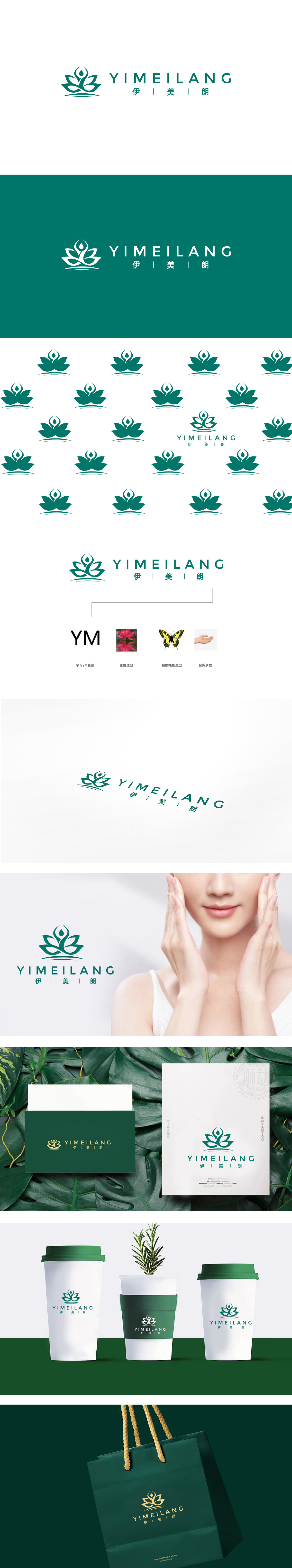
狮动设计以莲花形态为基底,莲花的花瓣轮廓巧妙融入了品牌缩写“YM”的曲线——花瓣似“Y”的舒展,如“M”的延伸,既保留了字母的识别性,符合瑜伽“与自然共生”的理念。莲花中心的“水滴+曲线”造型,其实是瑜伽“莲花坐”的简化,水滴象征“专注与平静”,曲线模拟人体盘坐的姿态,将“瑜伽”这一核心业务藏于自然意象中,绿色本身与“健康、自然”强关联,强化了“美从健康中来”的品牌主张。整体设计将“自然意象+字母变形+服务符号”的三重设计逻辑,将伊美朗的“瑜伽品牌”属性、“美”的核心价值、“陪伴式服务”的特点,用最简洁的视觉语言传递了出来。
The lion dance design is based on the lotus shape, and the petal outline of the lotus is skillfully integrated into the curve of the brand abbreviation "YM"-the petal stretches like "Y", such as the extension of "M", which not only retains the recognition of letters, but also conforms to the concept of "symbiosis with nature" in yoga. The shape of "water drop+curve" in Lotus Center is actually a simplification of yoga "Lotus Sitting". The water drop symbolizes "concentration and calmness", and the curve simulates the posture of human body sitting, hiding the core business of "yoga" in the natural image. Green itself is strongly related to "health and nature".


扫码或拨打添加客服微信


