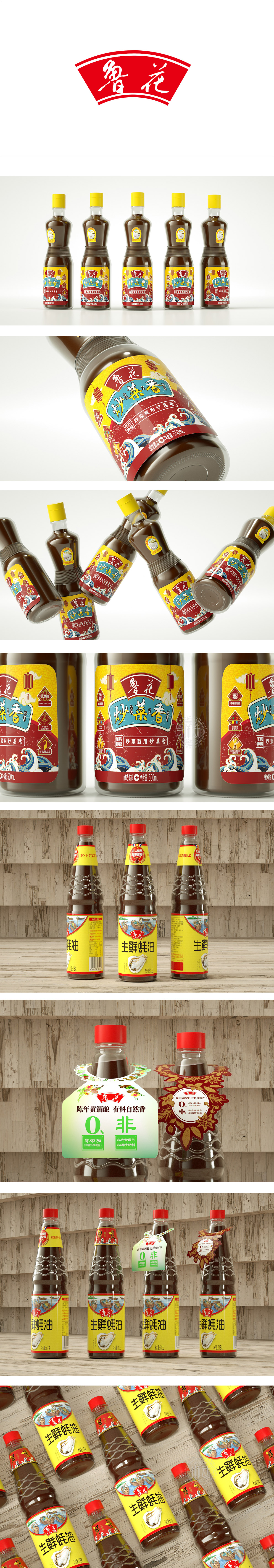
狮动设计采用“海边捕捞”的画面,渔船的小插画太有“烟火气”了——戴斗笠的渔翁、停在岸边的小船,像在说“我们的原料刚从海边捞上来”,传递“原料来自源头、传统工艺”的信任感,符合大众对“生鲜食品”的原产地联想。 选择明亮的黄色作为标签底色,符合食品包装的“温暖、开胃”情绪属性,同时黄色在货架上的视觉冲击力强,能从同类产品中“跳出来”;红色瓶盖+波浪纹瓶身:红色瓶盖形成“点睛之笔”,与黄色标签形成强烈对比,进一步提升辨识度;波浪纹瓶身则模拟海浪形态,既呼应“海鲜”主题,同时让包装更有“流动感”(暗示蚝油的“鲜活”质地)。生蚝的饱满质感、鲜美的纹路,几乎是“把新鲜嚼在嘴里”的视觉化,不用看“生鲜”两个字,消费者瞬间就能get“这蚝油是用活蚝做的”。
Lion design adopts the picture of "fishing by the sea", and the small illustrations of fishing boats are too "pyrotechnic"-the fisherman wearing a hat and the boat parked on the shore are like saying "our raw materials have just been fished from the sea", conveying the trust that "raw materials come from the source and traditional techniques", which is in line with the origin association of "fresh food" by the public. Choosing bright yellow as the label background color conforms to the emotional attributes of "warmth and appetizing" of food packaging, and at the same time, yellow has strong visual impact on the shelf and can "jump out" from similar products; Red bottle cap+wavy bottle body: the red bottle cap forms a "finishing touch", which is in sharp contrast with the yellow label to further enhance the recognition.


扫码或拨打添加客服微信


