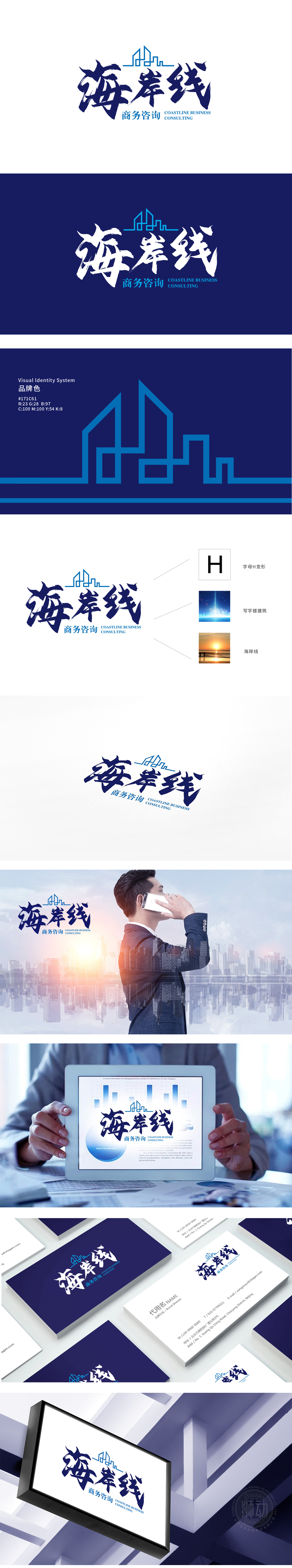
狮动设计以字母“H”为原型,通过折线切割与高低错落的排布,自然模拟出城市天际线轮廓,暗示商务咨询的“城市服务属性”与“空间规划感”。海浪的流动性与边界感被巧妙转化为商业隐喻——既象征企业服务的“包容性”,也暗含“战略边界”的咨询价值。海岸线”三个字采用毛笔笔触的行草字体,笔锋的顿挫与墨色的浓淡对比,打破了商务咨询行业常见的“理性冷感”,注入东方文化中“运筹帷幄”的智慧意象。整体通过“具象符号(建筑/海岸线)—抽象隐喻(H形结构/流动边界)—文化载体(书法字)”的三层递进,成功构建了“专业可靠+东方智慧+全球视野”的品牌形象。
Lion Design takes the letter "H" as the prototype, and naturally simulates the outline of the city skyline through folding lines and staggered arrangement, implying the "urban service attribute" and "spatial planning sense" of business consultation. The fluidity and sense of boundary of ocean waves are skillfully transformed into business metaphors, which not only symbolize the "inclusiveness" of enterprise services, but also imply the consulting value of "strategic boundary". The word "coastline" adopts the cursive font of brush strokes, and the contrast between the ups and downs of the pen tip and the shades of ink breaks the common "rational coldness" in the business consulting industry and injects the wisdom image of "strategizing" into the oriental culture.


扫码或拨打添加客服微信


