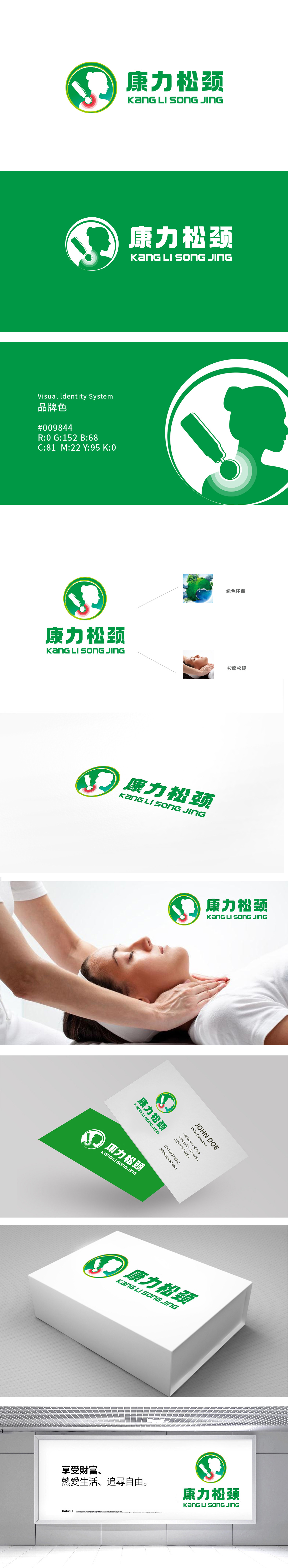
狮动设计以绿色圆形为基底,绿色与LOGO色调统一,传递“天然、安全”的产品属性,符合保健品行业的视觉认知习惯。内圈融入侧身人像轮廓与突出的颈部红色穴位/按摩符号,直观点明“松颈”核心功能。绿色象征健康、自然,红色动态符号,强化“舒缓”“疗愈”的视觉联想,整体设计简洁且具有医疗健康类产品的专业感。
Lion design is based on green circle, and the colors of green and LOGO are unified, which conveys the product attributes of "nature and safety" and conforms to health care industry's visual cognitive habits. The inner ring is integrated with the silhouette of the sideways portrait and the prominent red acupuncture point/massage symbol of the neck, which directly illustrates the core function of "relaxing the neck". Green symbolizes health and nature, and red is a dynamic symbol.


扫码或拨打添加客服微信


