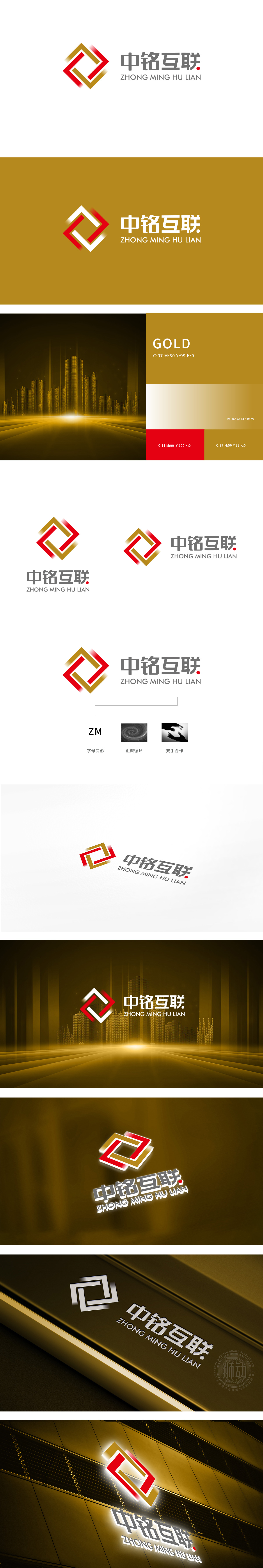
狮动设计以“字母变形”为基底,构建品牌基因,LOGO主体由红、金两色几何图形构成,直观呈现“ZM”(中铭首字母)的变形设计——红色与金色线条交织成菱形框架,内部通过折线形成动态闭环,既保留了“Z”“M”的字母轮廓辨识度,又通过棱角分明的线条传递互联网行业的科技感与前瞻性。红金配色则兼顾了专业稳重(金色象征品质与信任)与活力创新(红色代表激情与突破),符合互联网企业“连接价值、驱动增长”的定位。
Lion Design is based on "letter deformation" to construct brand genes. The main body of LOGO is composed of red and gold geometric figures, which intuitively presents the deformation design of "Z”“M" (Chinese initials)-the red and gold lines are interwoven into a diamond-shaped frame, and the inner part forms a dynamic closed loop through broken lines, which not only retains the letter outline recognition of "Z" and "M", but also conveys the scientific and technological sense and foresight of the Internet industry through angular lines. The color matching of red and gold takes into account both professional stability.


扫码或拨打添加客服微信


