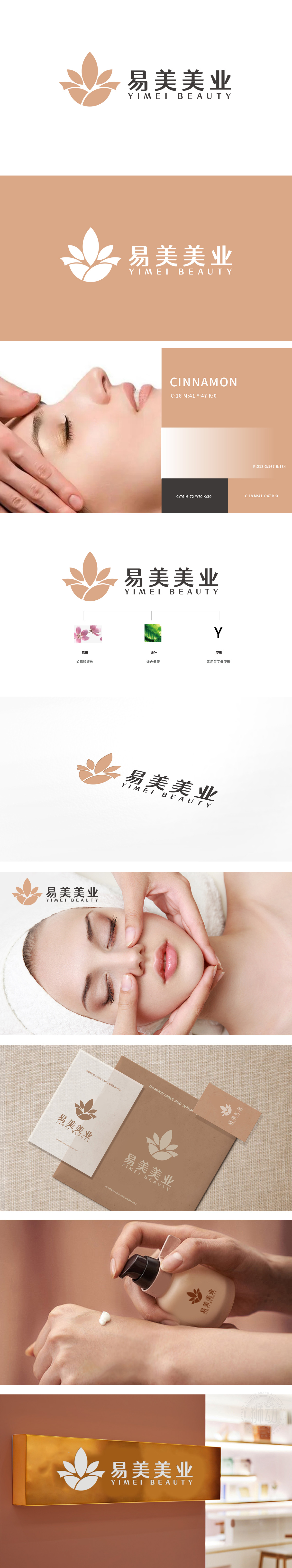
狮动设计以花瓣绽放为视觉主体(“如花般绽放”),采用柔和的暖色调,传递细腻、温柔的女性化气质,贴合美业“焕活、新生”的核心诉求。花瓣边缘的流畅线条既模拟了自然花卉的舒展形态,又暗藏首字母“Y”的变形设计,实现“自然美学”与“品牌符号”的双重表达。(暖橙色):延续花瓣意象,象征活力、温暖与美丽蜕变,符合日化产品带给用户的“愉悦感”与“焕新感”。构建“外在绽放+内在滋养”的品牌联想。
Lion design takes petal blooming as the visual subject ("flower blooming"), and adopts soft warm orange tone to convey delicate and gentle femininity, which fits the core appeal of "rejuvenation and rebirth" in the beauty industry. The smooth lines on the edge of petals not only simulate the stretching form of natural flowers, but also conceal the deformation design of the initial "Y", realizing the dual expression of "natural aesthetics" and "brand symbol".Continues the petal image, symbolizing vitality, warmth and beautiful transformation, and conforms to the "pleasure" .


扫码或拨打添加客服微信


