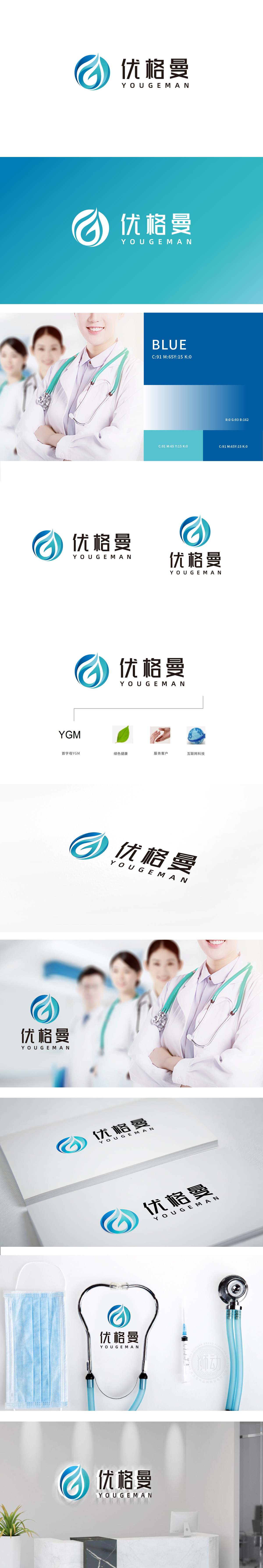
狮动设计以蓝色渐变圆形为基底,抽象化的“水流漩涡+飞鸟展翅”形态,蓝色系天然关联医疗、科技行业的专业信赖感,而流动的曲线既象征“健康循环”,又通过漩涡的动态感传递“互联、融合”的科技属性。这“一语双关”的图形设计,通过柔和曲线传递出“人文关怀”——这与医疗科技领域“技术理性与人文温度平衡”的趋势高度契合。整体设计通过“核心图形隐喻+辅助符号锚定+色彩心理暗示”,成功将“科技、健康、服务、互联”四大核心价值浓缩为可感知的视觉语言。
LionDesign is based on the blue gradient circle, with the abstract form of "water vortex+birds spreading their wings". Blue is a professional sense of trust naturally associated with medical and scientific industries, and the flowing curve not only symbolizes "healthy cycle", but also conveys the scientific and technological attributes of "interconnection and integration" through the dynamic sense of vortex. This "pun intended" graphic design conveys "humanistic care" through soft curves, which is highly consistent with the trend of "technical rationality and humanistic temperature balance" in the field of medical science and technology.


扫码或拨打添加客服微信


