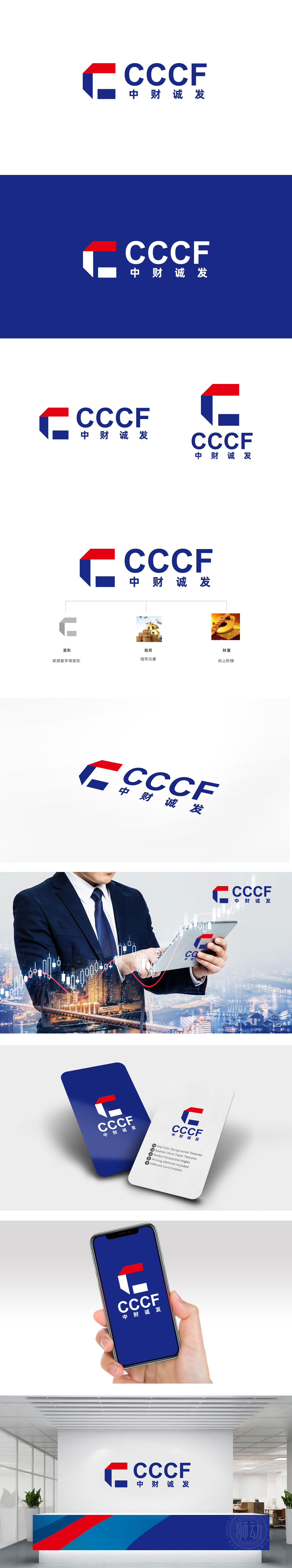
狮动设计采用首字母“C”的变形设计,行业辨识度高 ,又通过硬朗的线条传递出金融领域的专业、稳健感。“钱币元素”:直接关联“投资”场景,用大众熟悉的视觉符号传递“资金管理、资产增值”的业务属性;“向上阶梯”:隐喻“财富向上积累”,既呼应金融行业对“增长”的追求,也传递出助力客户财富阶梯式提升的品牌承诺。,整体设计既有视觉冲击力,又传递出“从专业服务到财富结果”的完整链路,同时色彩与结构的搭配精准匹配金融行业的专业调性。
Liondesign adopts the deformation design with the initial "C", which has high industry recognition and conveys the sense of professionalism and stability in the financial field through tough lines. "Coin element": directly related to the "investment" scene, conveying the business attributes of "fund management and asset appreciation" with familiar visual symbols; "Ascending ladder": the metaphor of "upward accumulation of wealth" not only echoes the pursuit of "growth" in the financial industry, but also conveys the brand promise that helps customers to enhance their wealth step by step.


扫码或拨打添加客服微信


