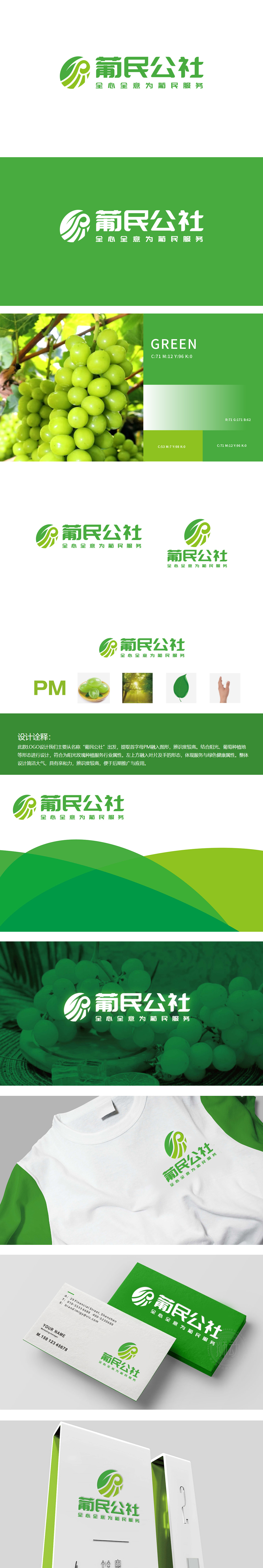
狮动设计以首字母“PM”切入,把抽象的字母变成了有农业温度的图形——左边的“P”像一片舒展的叶子(呼应绿色农业)“M”则藏着手的轮廓(传递服务属性)。每一笔都在说“我懂种植”,圆润的果外形、新鲜的绿色,像刚从地里摘下来的,瞬间唤起种植户的共鸣——这就是我们种的葡萄!“葡民公社”的服务都是有温度的、贴近农民的。这种“图形+情感”的设计,正好戳中了农业合作社“为农民服务”的核心价值,让品牌不仅有“农业味”,更有“人情味”。
Lion design the first letter "PM" and turns the abstract letter into a figure with agricultural temperature-the "P" on the left is like a stretched leaf (echoing green agriculture) and the "M" hides the outline of the hand (conveying service attributes). Every stroke is saying "I know how to plant". The round fruit shape and fresh green color, like those just picked from the ground, instantly arouse the resonance of growers-this is the grape we planted! The services of "Portuguese Commune" are warm and close to farmers. This "graphic+emotional" design just pokes the core value of "serving farmers" .


扫码或拨打添加客服微信


