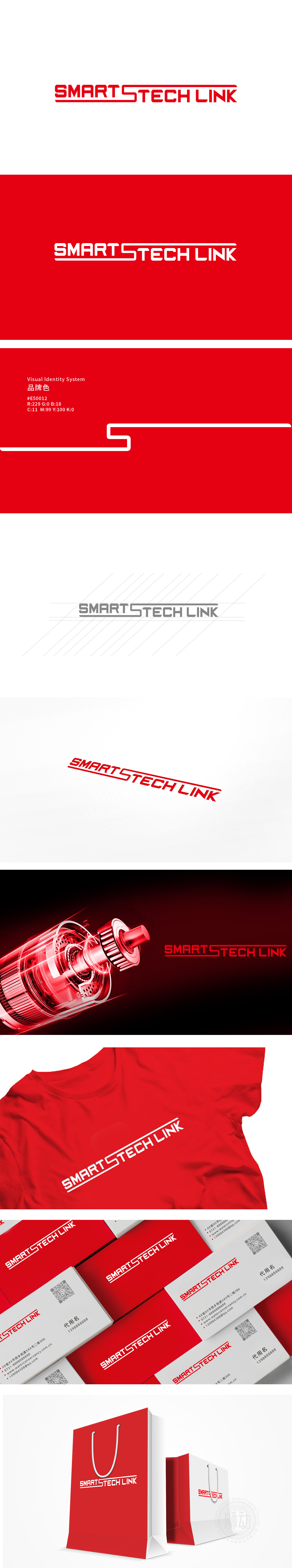
狮动设计采用重工机械风格的字体设计:力量感与工业基因,字形结构:字体采用等宽、方直的几何线条,笔画边缘硬朗无圆角,,呼应重工机械的坚固、精密属性。“TECH”的“C”与“L”的竖线形成“咬合”结构,仿佛机械部件的榫卯或齿轮联动,强化工业产品的“连接”意象。整体用最简洁的视觉语言,让“重工机械”的硬朗、“科技”的精密、“连接”的动态三者形成有机整体,既符合工业品牌的认知惯性,又赋予其现代设计的高级感与叙事性。
Lion design adopts heavy machinery style font design: sense of strength and industrial genes,Font structure: the font adopts geometric lines with equal width and straight square, and the edges of strokes are tough without rounded corners, which echoes the firmness and precision of heavy machinery. The vertical lines of "C" and "L" of "TECH" form a "bite" structure, just like the tenon-mortise or gear linkage of mechanical parts, which strengthens the image of "connection" of industrial products. Using the simplest visual language as a whole, the toughness of "heavy machinery".


扫码或拨打添加客服微信


