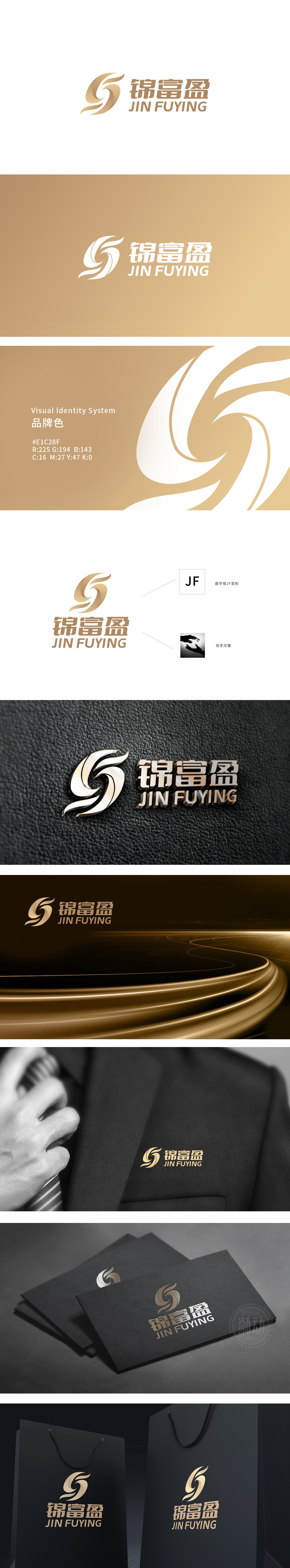
狮动设计以金属光泽的金色为主调,通过几何曲线与流动线条的交织,将“J”“F”字母解构重组为动态旋转的抽象符号,形似科技感十足的能量环或数据流轨迹,打破传统字母标识的静态感,传递品牌的创新活力与前沿视野。“双手交替”的科技化演绎,犹如精密科技组件的咬合与联动,既保留了“合作共赢”的人文内核,又赋予其科技行业的精密、可靠属性,实现情感温度与专业质感的双重表达。整体设计以简约而富有张力的图形语言,将“锦富盈”的品牌名称、首字母基因与协作理念,通过科技感的视觉符号高度浓缩,既彰显狮动在品牌视觉转化上的强大创意,也为“锦富盈”构建了兼具记忆点与行业属性的科技化品牌形象。
Liondesign takes the golden color of metallic luster as the main tone, and through the interweaving of geometric curves and flowing lines, it deconstructs and reorganizes the letters "J" and "F" into abstract symbols that rotate dynamically, which looks like an energy ring or data flow track with a sense of science and technology, breaking the static sense of traditional letter logos and conveying the innovative vitality and cutting-edge vision of the brand. The scientific deduction of "alternating hands" is like the bite and linkage of precision technology components. which makes new customers marvel not only at the design aesthetics, but also at the pixel-level business logic coding behind it.


扫码或拨打添加客服微信


