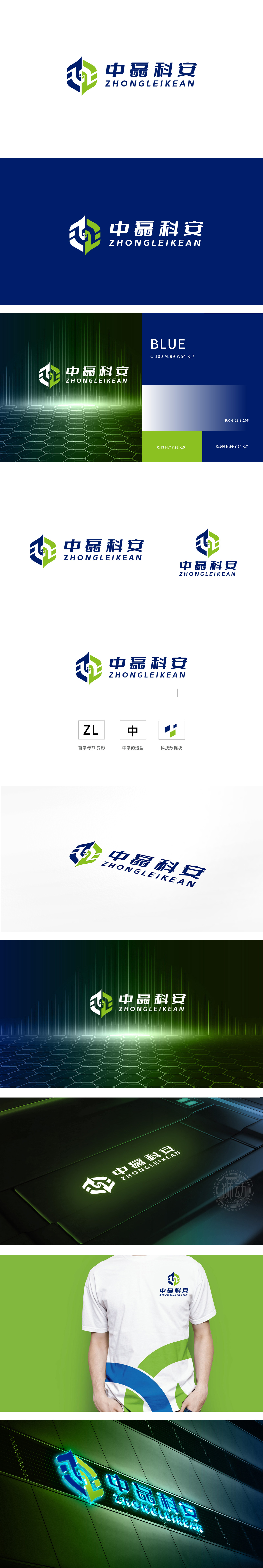
狮动设计采用首字母变形与“中”字的隐性结合,Z的动态感:左侧倾斜的折线形成“Z”的骨架,传递科技行业的活力与突破感;L的包裹与“中”的暗喻:,既构成“L”的收尾,又通过对称结构隐约呼应“中”字的方正轮廓,强化品牌名称的识别性。图形中嵌入的绿色小方块(“科技数据块”)是点睛之笔:蓝色(专业、可靠)与绿色(创新、安全)形成冷暖平衡,绿色块如“数据单元”般嵌入蓝色体系,象征科技企业的数据驱动属性;暗示品牌在“安全守护”与“技术创新”上的双重追求。
Lion design adopts the implicit combination of the first letter deformation and the word "zhong", and the dynamic sense of Z: the left inclined broken line forms the skeleton of "Z", which conveys the vitality and breakthrough sense of science and technology industry; The metaphor of "L" and "Zhong" not only constitutes the ending of "L", but also vaguely echoes the square outline of the word "Zhong" through the symmetrical structure, which strengthens the recognition of brand names. The small green squares embedded in the graphics ("science and technology data blocks") are the finishing touch: blue (professional and reliable) and green (innovative and safe) form a cold and warm balance.


扫码或拨打添加客服微信


