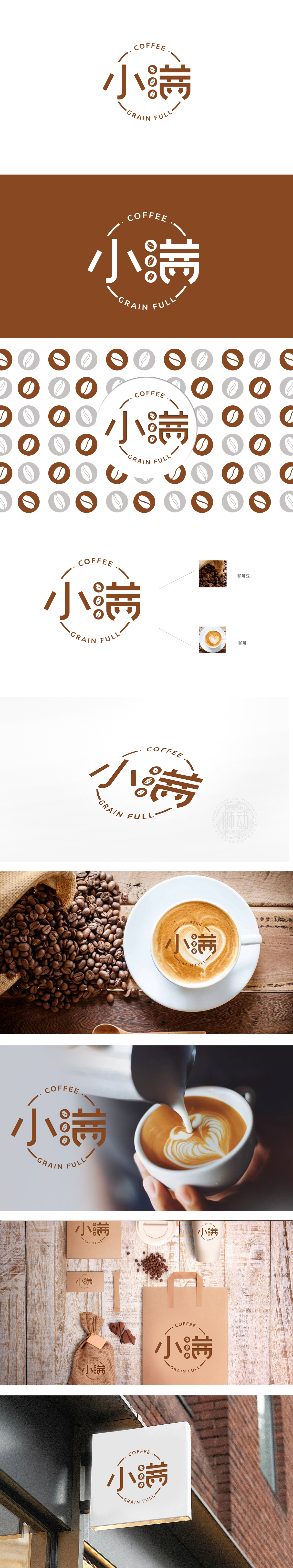
狮动设计以“小满”二字为主体,字体采用圆润又不失力度的字体,传递出东方文化中的“含蓄之美”。中间嵌入三颗咖啡豆图案,既呼应的“颗粒饱满”之意,又直接点明咖啡品类,圆形边框与色彩的温暖感: 环绕的圆环设计柔化了整体轮廓,搭配低饱和的棕色系,既传递出咖啡的醇厚质感,又营造出包容、亲切的氛围,反而像一杯暖手的咖啡,自带“治愈感”。小满”本是节气,寓意“物致于此小得盈满”,不追求极致的“满”,而是恰到好处的满足——这种理念与现代都市人对咖啡的需求高度契合:它不仅是饮品,更是一种“小确幸”的生活仪式。品牌名自带情感温度,让咖啡超越了功能属性,成为“美好生活”的符号。
Lion design takes the word "Xiaoman" as the main body, and the font adopts a mellow and vigorous calligraphy style, which conveys the "implicit beauty" in oriental culture. The pattern of three coffee beans is embedded in the middle, which not only echoes the meaning of "full granules", but also directly points out the coffee category, the circular frame and the warmth of color: the design of the surrounding ring softens the overall outline, and with the low saturated brown color, it not only conveys the mellow texture of coffee, but also creates an inclusive and cordial atmosphere. On the contrary, it is like a cup of coffee that warms hands and brings its own "healing feeling". Xiaoman is a solar term, which means that "things are so small that they are full", instead of pursuing the ultimate "fullness".


扫码或拨打添加客服微信


