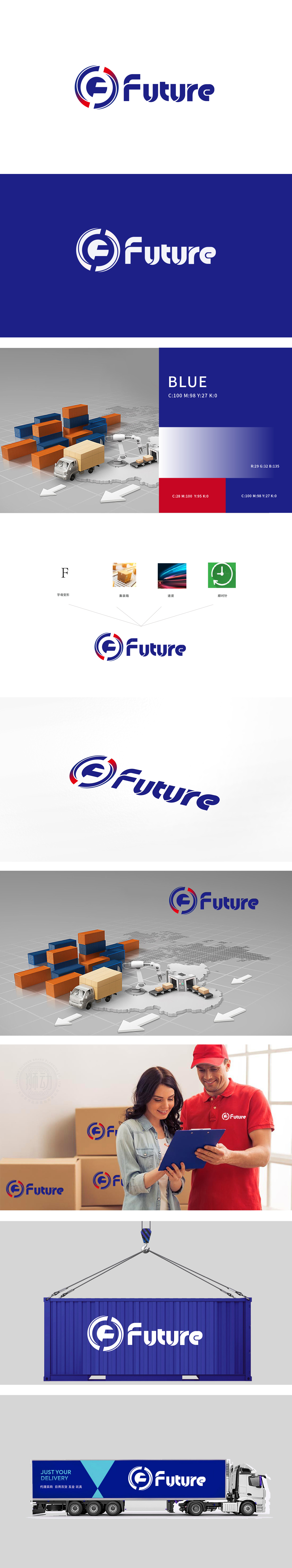
狮动设计采用“字母F变形”,环形既呼应了“顺时针”的箭头动态,又形似物流周转中的循环流程,暗示货物的高效流转与闭环管理,让“F”的字母形态兼具品牌辨识度与物流行业属性。速度与动态感的视觉传递,整体造型呈现向右的运动趋势,蓝色环形仿佛包裹着高速流动的能量,直观传递出物流运输的“时效性”与“前瞻性”,与“速度”元素形成巧妙呼应。设计通过拆解(字母、集装箱、速度、顺时针)与重构(环形F+动态字体),将物流场景的核心要素浓缩为极具记忆点的视觉符号,既展现了对图形语言的精准把控,也凸显了品牌在物流领域的定位与愿景,确实令人佩服这种“以形表意、以意传情”的设计能力!
Lion Design adopts the "letter F deformation", and the ring shape not only echoes the "clockwise" arrow dynamics, but also resembles the circular process in logistics turnover, suggesting the efficient circulation and closed-loop management of goods, so that the letter shape of "F" has both brand recognition and logistics industry attributes. The visual transmission of speed and dynamic sense, the overall shape shows a movement trend to the right, and the blue ring seems to wrap the high-speed flowing energy, which intuitively conveys the timeliness and foresight of logistics and transportation, and forms a clever echo with the "speed" element.Through disassembly (letters, containers, speed, clockwise) and reconstruction.


扫码或拨打添加客服微信


