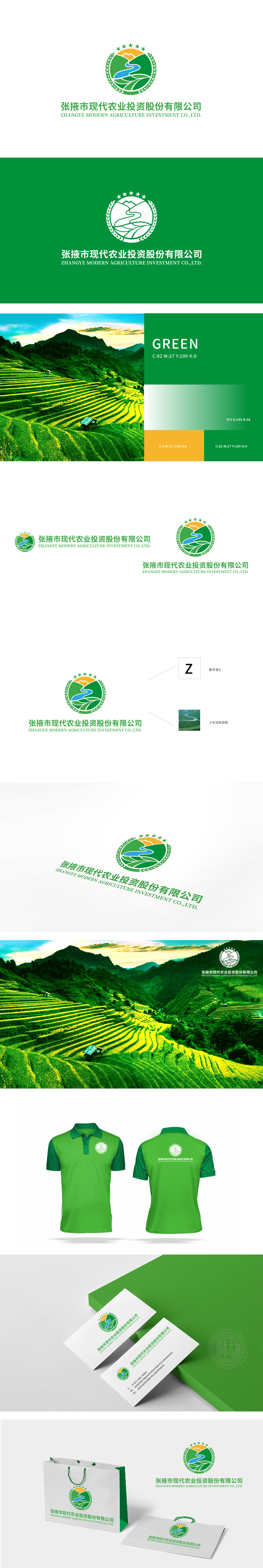
狮动设计以“地域基因+现代农业”为核心逻辑,通过具象元素与抽象符号的融合,构建了兼具识别性、记忆点与品牌内涵的视觉体系,首字母“Z”的“地域化转译”,而是将其与张掖市的标志性自然元素——河流(黑河)进行“同构设计”:“Z”的笔画被处理为蜿蜒的河流形态,既保留了字母的识别性,又通过“河流”这一地标符号,强绑定了企业“扎根张掖、依托地域资源”的核心定位;河流形态进一步延伸为农田肌理,将“水”与“农”直接关联——农业的根本是水,而张掖作为“河西走廊”的重要农业区,河流是其现代农业发展的命脉,这一设计实现了“字母-自然-产业”的三重隐喻。
Lion design takes "regional gene+modern agriculture" as its core logic, and through the fusion of concrete elements and abstract symbols, it constructs a visual system with recognition, memory and brand connotation.The "regional translation" of the initial letter "Z" is an "isomorphic design" with the iconic natural element of Zhangye City-Heihe River: the strokes of "Z" are treated as a meandering river shape, which not only retains the recognition of letters, but also strongly binds the core positioning of enterprises to "take root in Zhangye and rely on regional resources" through the landmark symbol of "River"; The river form is further extended to the texture of farmland.


扫码或拨打添加客服微信


