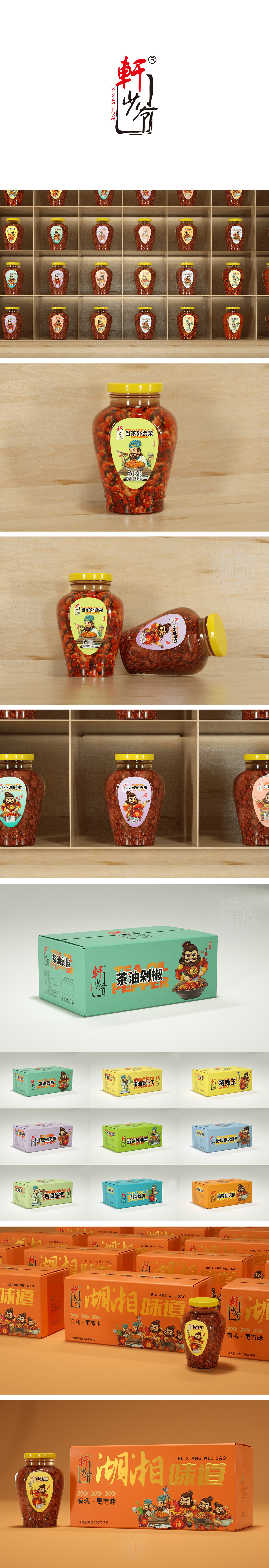
狮动设计以身着传统服饰的卡通老者形象,勾勒出“长辈”的慈祥感,人物手中的勺子和装满菜品的碗,形成“正在品尝/分享美食”的动态场景,视觉上强化了产品的“可食用性”和“美味感,通过人物形象传递“家庭自制”“传统手艺”的情感联想,传递“家乡风味”,新中式LOGO,红色“軒”字如点睛之笔,黑色“燒”字暗藏巧思,边框与留白的运用则赋予传统元素以呼吸感,传递“传承经典、匠心智造”的品牌调性。整体标签设计从人物、色彩到食材呈现,都围绕“家庭餐桌”“家乡风味”展开,突出内容物本身,传递“实在、地道、无过多修饰”的产品特性,符合消费者对“下饭小菜”的功能期待(即开即食、口味浓郁、适配日常餐食)。
Lion design uses the cartoon old man dressed in traditional costumes to outline the kindness of the "elders". The spoons and bowls filled with dishes in the hands of the characters form a dynamic scene of "tasting/sharing food", which visually strengthens the "edibility" and "deliciousness" of the products, and conveys the emotional association of "home-made" and "traditional craftsmanship" through the characters, and conveys the "hometown flavor" and the new Chinese LOGO. The overall label design revolves around "family dining table" and "hometown flavor" from characters and colors to the presentation of ingredients, highlighting the content itself and conveying the product characteristics of "real, authentic and without too much decoration".


扫码或拨打添加客服微信


