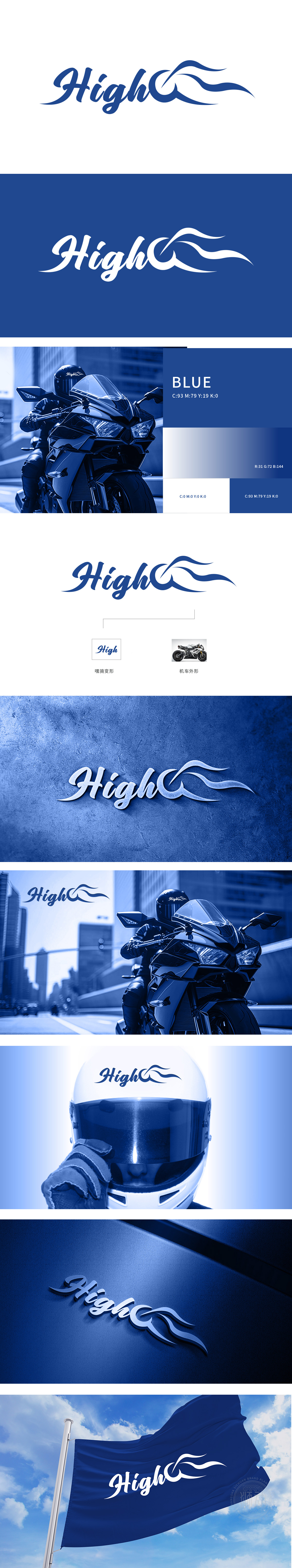
狮动设计采用流畅的手写体曲线,字母“C”向右延伸出飘逸的流线,既像“骑行时引擎的高亢声浪”、摩托车飞驰时的尾迹,又暗合“High”所传递的“高速、激情”意象,让(骑手)能快速产生“这是属于我们的社群符号”的归属感。蓝色主色调则强化了科技感与信任感,整体造型打破了静态文字的束缚,充满动态张力。精准贴合了摩托车俱乐部的“速度、激情、社群”核心属性。
Lion design adopts a smooth handwritten curve, and the letter "C" extends to the right with an elegant streamline, which is not only like the High-pitched sound of the engine when riding, but also coincides with the image of "high speed and passion" conveyed by "high", so that (the rider) can quickly generate a sense of belonging that "this is a symbol of our community". The blue main color strengthens the sense of science and technology and trust, and the overall shape breaks the shackles of static words and is full of dynamic tension.


扫码或拨打添加客服微信


