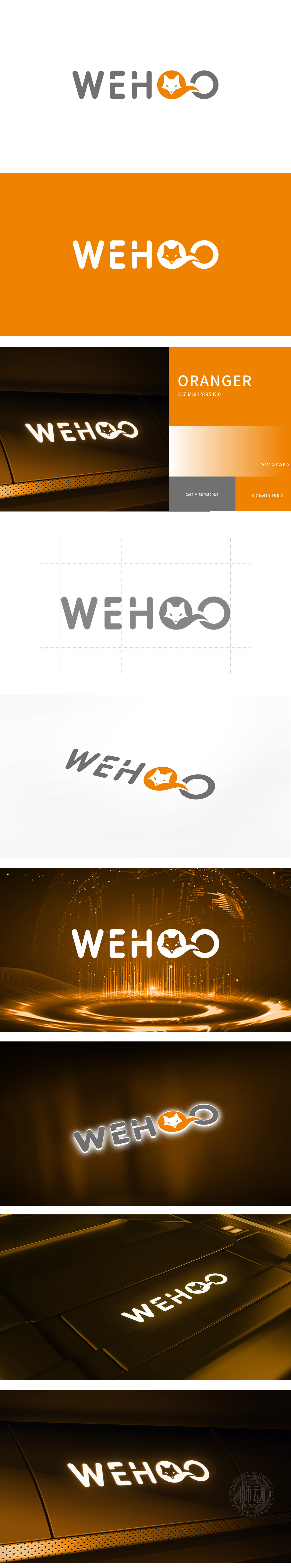
狮动设计通过橙色圆形内的狐狸头像,是设计的点睛之笔:狐狸常被关联“聪明、敏捷、洞察”,暗合互联网产品对“快速响应”“精准服务”的功能诉求,更具亲和力,狐狸面部极简线条的表现力,形成“图形-文字”的自然衔接,既简化识别成本,又赋予静态标志动态延伸的想象空间。橙色作为主色传递活力、温暖,与灰色字体形成冷暖对比,既突出核心图形,又通过低饱和度灰色平衡视觉张力:整体用符号降低认知成本,用细节传递品牌性格。图形上,以“狐狸+圆”的组合构建“聪明、温暖”的品牌人格。
Lion design adopts the head of the fox in the orange circle, which is the crowning touch of the design: the fox is often associated with "cleverness, agility and insight", which coincides with the functional demands of Internet products for "quick response" and "accurate service" and has more affinity. The expressive force of the minimalist lines on the fox's face forms a natural connection of "graphics and words", which not only simplifies the identification cost, but also gives the imagination space for the dynamic extension of static signs. As the main color, orange conveys vitality and warmth, which forms a cold and warm contrast with gray fonts.


扫码或拨打添加客服微信


