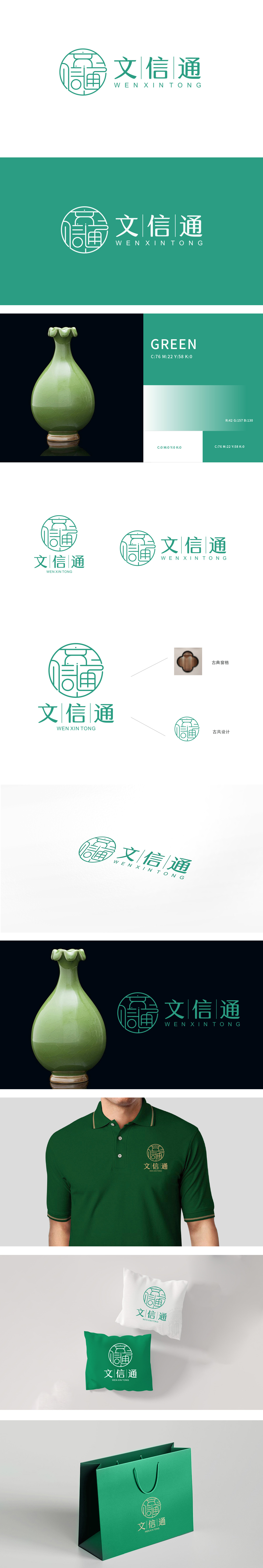
狮动设计采用单线条勾勒,将“文”“信”“通”三字的核心笔画解构重组,形成“以文为信,以信致通”的视觉隐喻。“通”字的走之底笔画交织,通过曲线与直线的穿插,打破了传统书法字体的拘谨,呈现出流动感——这种设计既呼应了“通”的顺畅之意,又通过圆形轮廓强化了“圆满、融通”的概念。绿色主色调(象征“生机、可靠、专业”)贯穿图形与文字,整体“以形载意,以意合道”通过几何化、符号化处理,让传统文化元素具备“当代传播力”。
Lion design is outlined by a single line, which deconstructs and reorganizes the core strokes of the words "Wen", "Xin" and "Tong" to form a visual metaphor of "taking Wen as the letter and letter as the communication". With the interweaving of strokes at the bottom of the character "Tong", through the interweaving of curves and straight lines, it breaks the formality of traditional calligraphy fonts and presents a sense of fluidity-this design not only echoes the smooth meaning of "Tong", but also strengthens the concept of "perfection and harmony" through the circular outline.


扫码或拨打添加客服微信


