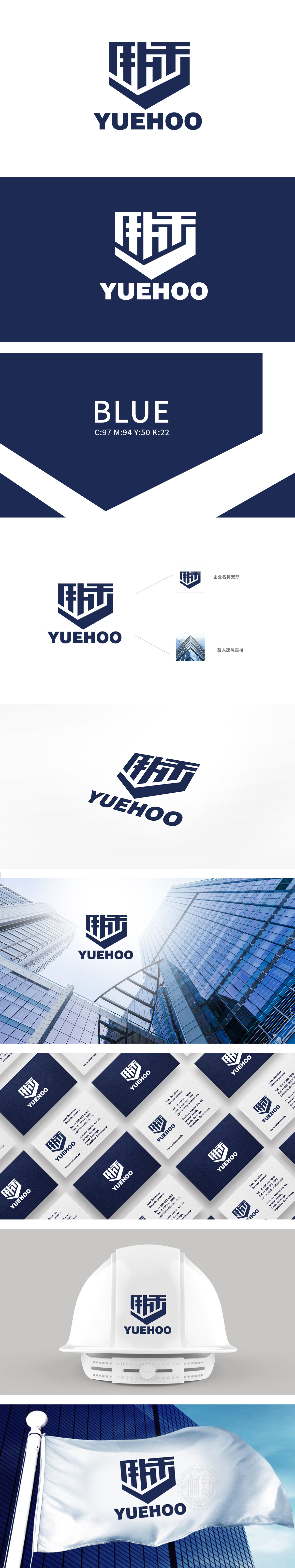
狮动设计采用以“跃禾”二字为核心进行视觉重构,将汉字笔画与盾形轮廓结合,形成稳定支撑,赋予标志建筑般的结构感,传递出行业属性中“稳固”“向上”的特质。深蓝色调进一步强化了“建筑行业”的冷静、专业气质。更巧妙的是,盾形顶部的锐角与高楼的向上趋势一致,通过抽象符号与具象场景的联想,让“高度”“地标”等行业关键词自然浮现。一眼即能感受到「建筑美学」与「品牌基因」的破壁融合。
Lion Design uses the word "Yuehe" as the core for visual reconstruction, and combines Chinese character strokes with shield-shaped contours to form a stable support, giving the symbol a sense of structure like a building and conveying the characteristics of "stability" and "upward" in the industry attributes. The dark blue tone further strengthens the calm and professional temperament of the "construction industry". More subtly, the acute angle at the top of the shield is consistent with the upward trend of tall buildings.


扫码或拨打添加客服微信


