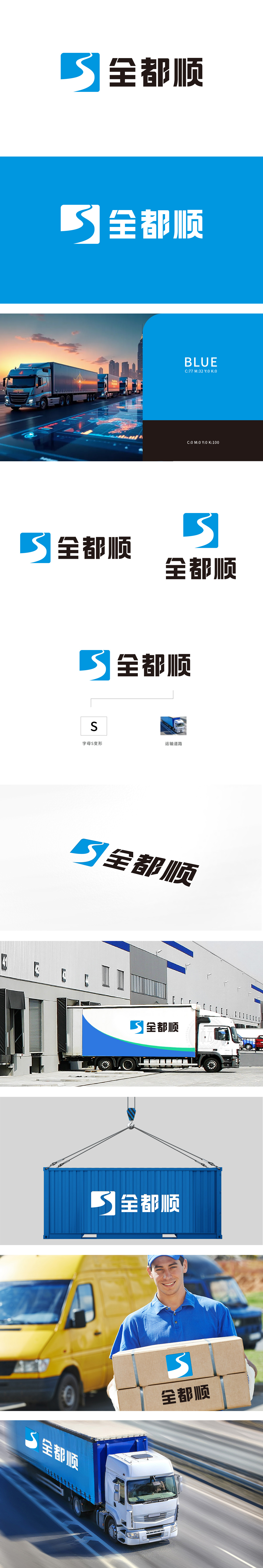
狮动设计采用蓝色方形造型,白色“S”既是品牌名称首字母的艺术化呈现,又通过流畅的曲线模拟了运输路径的动态感,直观传递“顺畅运输”的核心价值。「全」字的宽博、「都」字的稳重、「顺」字的收笔斜切,组合成「全覆盖、无死角、强保障」的视觉宣言。文字的「重量感」与S形的「流动感」形成刚柔对冲,既强调物流行业「重承诺、强执行」的硬实力,又不失「灵活应变」的服务属性。整体设计以极简的元素承载了丰富的行业信息,既符合现代品牌的视觉审美趋势,堪称“小图形大内涵”的典范。
Lion design adopts a blue square shape, and the white "S" is not only an artistic presentation of the initials of the brand name, but also simulates the dynamic sense of the transportation path through a smooth curve, intuitively conveying the core value of "smooth transportation". The broadness of the word "Quan", the steadiness of the word "Du" and the oblique cutting of the word "Shun" are combined into a visual declaration of "full coverage, no dead ends and strong protection". The "sense of weight" of words and the "sense of mobility" in the shape of S form a rigid-flexible hedge, which not only emphasizes the hard power of "emphasizing commitment and enforcement" in the logistics industry, but also loses the service attribute of "flexibility".


扫码或拨打添加客服微信


