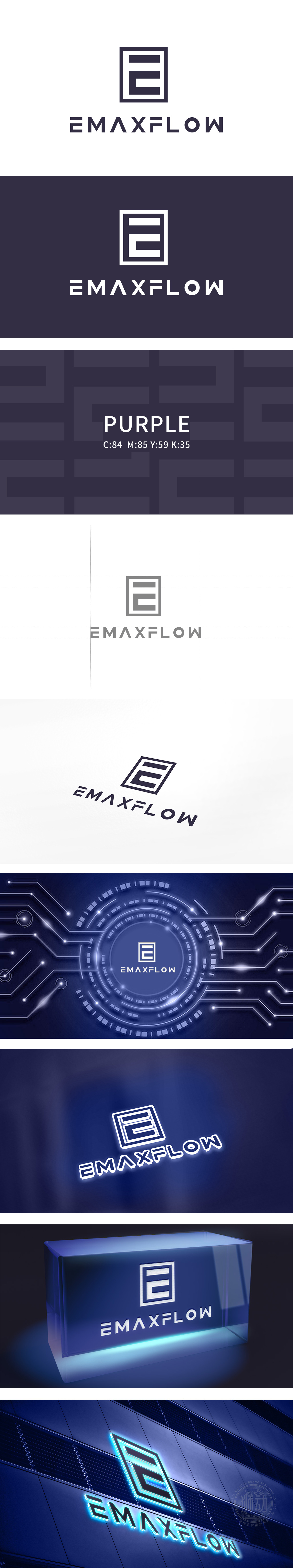
狮动设计以由“E”字母变形而来的正方结构,方框与内部“E”形成“外方内方”的嵌套结构,线条粗细一致,整体呈现绝对对称的几何平衡,传递出稳定、可靠的专业气质,符合科技类品牌对“精密”“可控”的视觉诉求。单看图形即可联想到“E”,同时方框也可隐喻“容器”“平台”,与“FLOW”(流程、流动)的品牌名形成“边界内的高效运转”的潜在联想。整体形成“图形即字体,字体即图形”的紧凑感。
Lion design is a square structure transformed from the letter "E", and the box and the internal "E" form a nested structure of "outer side and inner side". The line thickness is consistent, and the overall geometric balance is absolutely symmetrical, conveying a stable and reliable professional temperament, which conforms to the visual demands of scientific and technological brands for "precision" and "controllability". Just looking at the figure can be associated with "e", and at the same time, the box can also be a metaphor for "container" and "platform", which forms a potential association with the brand name of "FLOW" (process and flow).


扫码或拨打添加客服微信


