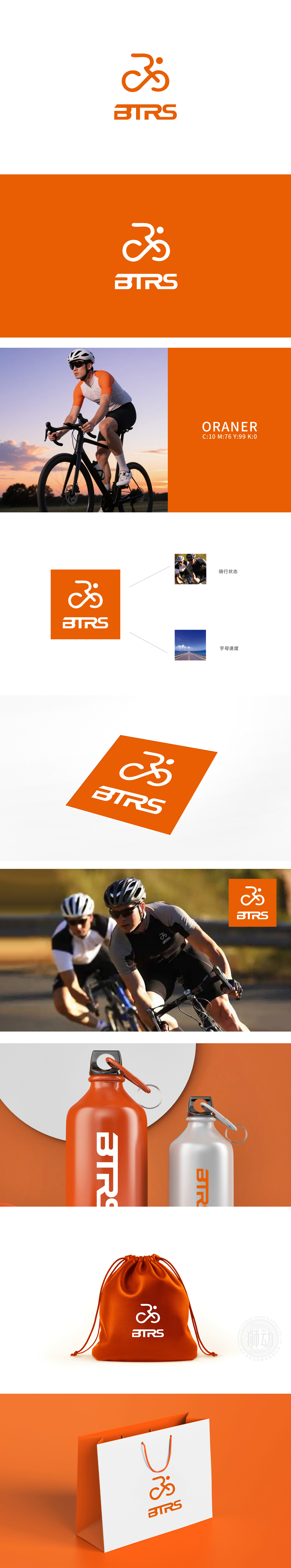
狮动设计以抽象线条勾勒出骑行者与自行车的融合形态:线条流畅连贯,数字的“3”与“骑行者”剪影巧妙结合,既像骑行者俯身冲刺的姿态,又通过圆形车轮强化自行车的核心意象,动态感十足,直观呼应了“骑行状态”,字母“B”“R”的倾斜,模拟了速度感,仿佛文字本身也在“向前飞驰”。橙色主色调充满活力与激情,象征骑行运动的能量与速度,视觉冲击力强,易于记忆。整体用橙色点燃骑行的热血基因,每一笔都是骑行的心跳。
Lion design outlines the fusion form of cyclist and bicycle with abstract lines: the lines are smooth and coherent, and the figure "3" is skillfully combined with the silhouette of "cyclist", which not only looks like the rider's posture of bending over and sprinting, but also strengthens the core image of bicycle through round wheels, which is full of dynamic feeling, intuitively echoes the "riding state", and the inclination of the letter "B" and "R" simulates the sense of speed, as if the text itself is also " The orange main color is full of energy and passion, symbolizing the energy and speed of cycling.


扫码或拨打添加客服微信


