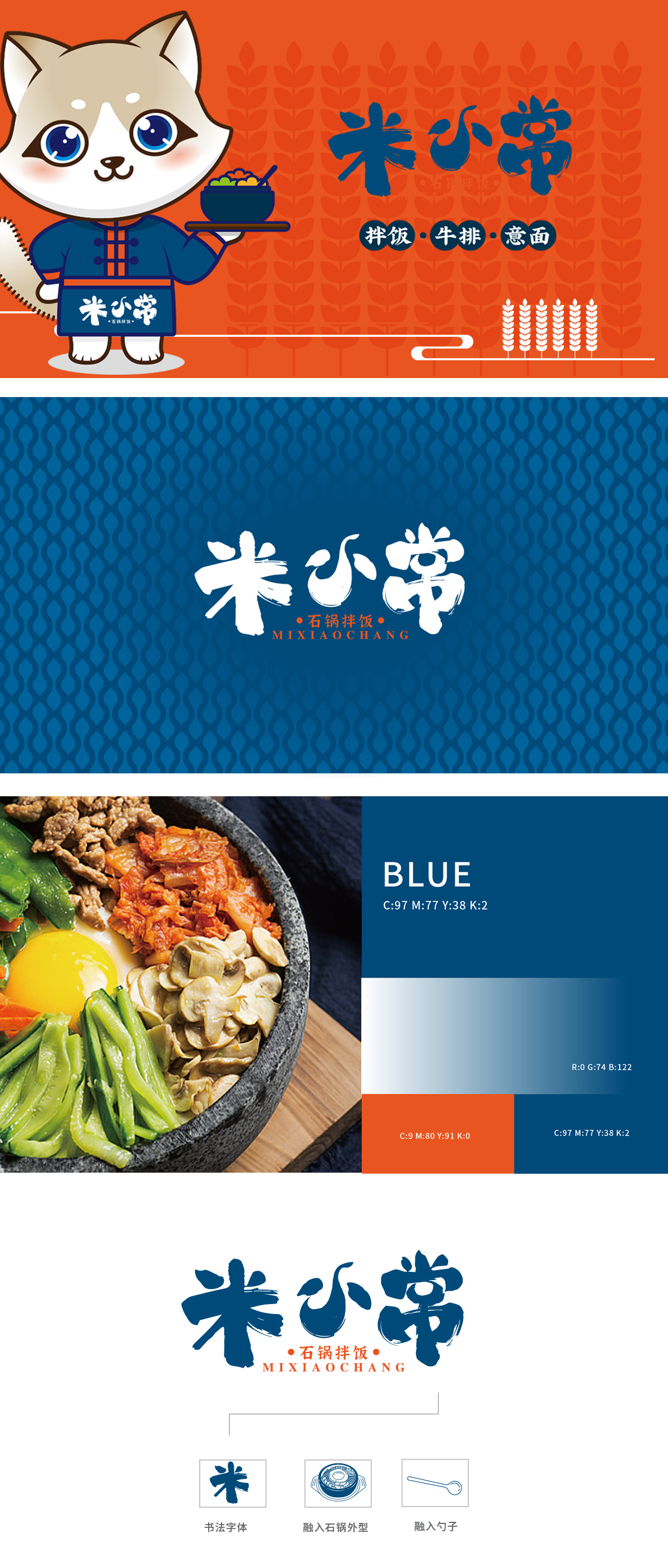
狮动设计以萌宠IP传递亲和力,“米小常”三个字采用毛笔书法字体,笔触洒脱有力,搭配小字“石锅拌饭”点明主打品类,卡通形象手中的黑色石锅造型经典,碗中五颜六色的食材正是石锅拌饭“丰富配料、营养均衡”的视觉符号。中式服饰与现代餐饮品类的结合,暗示品牌在传统拌饭基础上的创新,满足多元口味需求,图形与文字信息形成“传统底蕴+年轻化表达”的统一。整体而言,这套设计用萌系IP打破传统餐饮的刻板印象,色彩、符号、文字的协同配合,既突出了“石锅拌饭”的核心品类,又传递出品牌“美味、多元、亲切”的调性,让人看完就有想“打卡”的冲动。
Lion design conveys affinity with cute pet IP, and the word "Mi Xiaochang" uses brush calligraphy font, which is free and easy, and with the fine print "bibimbap", the main category is pointed out. The black stone pot in the cartoon image is classic in shape, and the colorful ingredients in the bowl are the visual symbols of bibimbap's "rich ingredients and balanced nutrition". The combination of Chinese clothing and modern catering categories implies that the brand is innovative on the basis of traditional bibimbap, which meets the needs of multiple tastes, and graphics and text information form the unity of "traditional heritage+young expression".


扫码或拨打添加客服微信