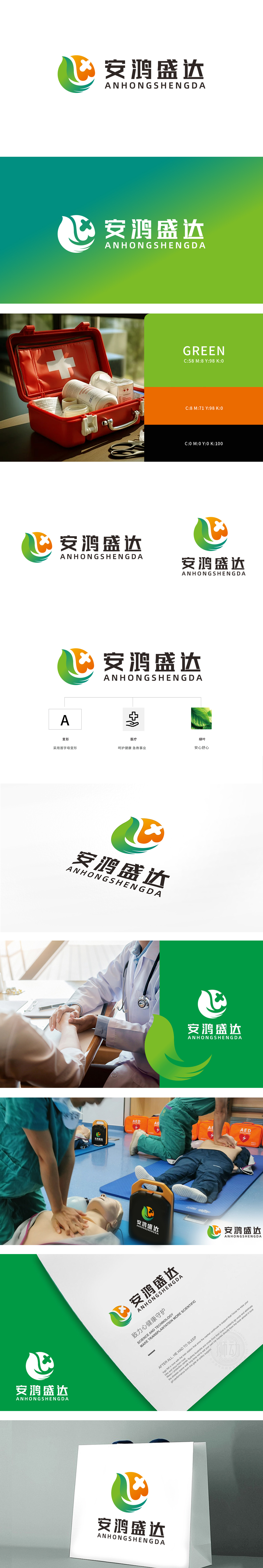
狮动设计采用橙色与绿色渐变轮廓中,隐藏了 “十字医疗符号”,直接关联医疗行业属性;“手托十字”图标进一步强化“呵护健康、急救事业”的定位,用图形语言传递了“专业救助”的核心功能,符合急救医疗领域对“可靠、及时、关怀”的视觉需求。首字母变形“A”的变形,构成了标识的视觉骨架,又通过简洁的线条增强了品牌识别性,这种“符号化”处理在急救场景中尤为重要——快速、直观的视觉符号,符合急救医疗对“高效传达”的需求。绿色与橙色的功能性搭配: 绿色(绿叶元素)象征“生命、安心、健康”,直接呼应“安心舒心”的品牌理念,橙色则传递“活力、温暖、紧迫感”,暗合急救医疗中“快速响应”的特质,色彩组合兼顾了情感抚慰与行动号召。
Lion design adopts orange and green gradient outline, which hides the "cross medical symbol" and directly relates to the attributes of medical industry; The icon "Holding the Cross" further strengthens the orientation of "health care and first aid", and conveys the core function of "professional rescue" with graphic language, which meets the visual demand of "reliability, timeliness and care" in the field of first aid medical care. The deformation of the initial "A" forms the visual skeleton of the logo, and the brand recognition is enhanced by simple lines. This "symbolization" treatment is particularly important in emergency scenes-fast and intuitive visual symbols meet the requirements of emergency medical care for "efficient communication".


扫码或拨打添加客服微信


