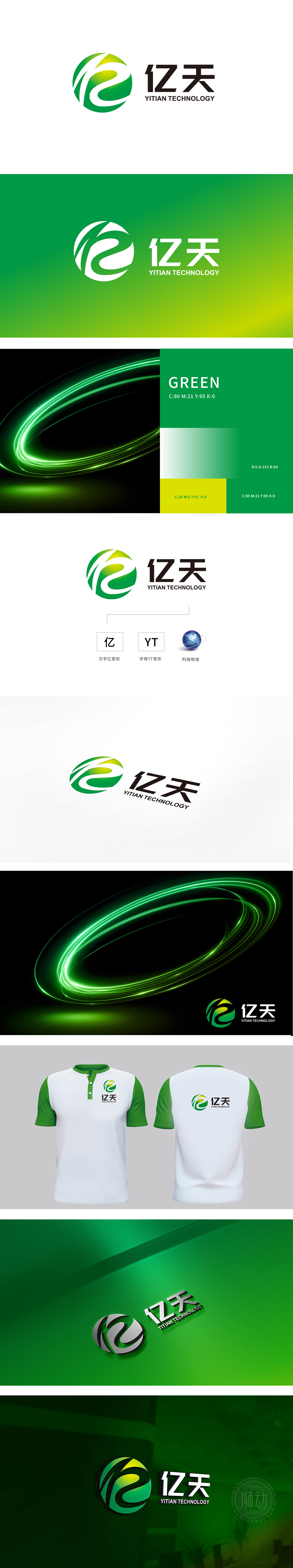
狮动设计以“汉字亿变形”,将书法笔触简化为几何线条,保留“亿”字的识别性,同时通过直线与折线的组合,呼应建材产品的“模块化”“标准化”特征,绿色渐变(深绿→浅绿→黄绿)的圆形基底,既象征地球、生态,也通过色彩传递“可持续建材”“节能科技”的品牌定位。整体设计以流动的线条”隐喻建材的工艺转化,“圆形与结构”象征生态与坚固,“色彩与符号”锚定科技与行业,用科技的“形”,说建材的“事。
Lion Design simplifies the calligraphy strokes into geometric lines with "100 million deformation of Chinese characters", and retains the identifiability of "100 million". At the same time, through the combination of straight lines and broken lines, it echoes the modularity and standardization characteristics of building materials products. The circular base with green gradient (dark green → light green → yellow green) not only symbolizes the earth and ecology, but also conveys "sustainable building materials" and "energy-saving technology" through colors.


扫码或拨打添加客服微信


