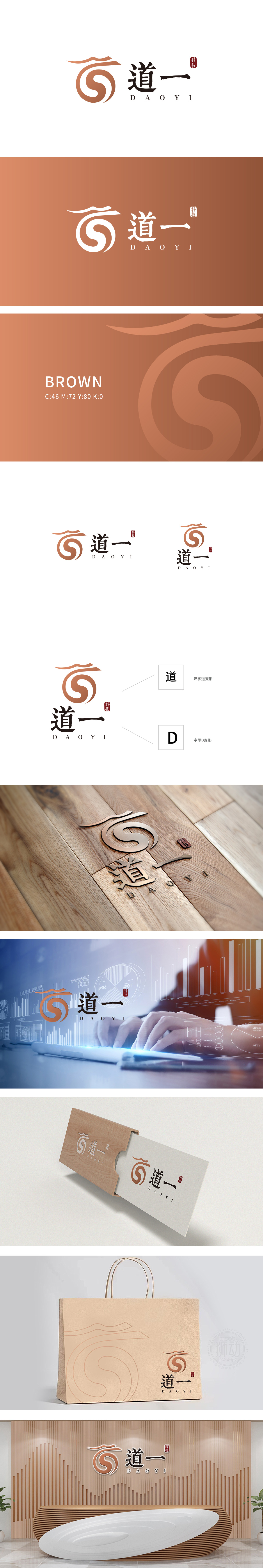
狮动设计以流畅的曲线构成,巧妙实现了 “汉字‘道’的意象化” 与 “字母‘D’的抽象化” 双重解读:图形以传统“太极图”的螺旋动态为基底,橙色与白色的渐变线条既呼应了“道”字首笔的飞白笔触,又暗合“道法自然”中循环往复、生生不息的东方哲学,传递出“本源”与“规律”的品牌内涵。“道一”二字采用 书法体与几何黑体的结合:“道”字保留毛笔书法的顿挫与气韵,撇捺舒展如行云流水;“一”字则以极简的水平直线呈现,既是对“大道至简”哲学的呼应,也通过直线的硬朗平衡了书法的飘逸,暗喻科技的理性与精准。整体设计真正做到了“形为科技、魂为中式”,从“文化符号”到“品牌认知”的高效传递
Lion design is composed of smooth curves, which skillfully realizes the double interpretation of "the imagery of Chinese characters' Dao' and the abstraction of letters' D'": the figure is based on the spiral dynamics of the traditional "Taiji diagram", and the gradual orange and white lines not only echo the flying white brushstrokes of the first word "Dao", but also coincide with the endless oriental philosophy in "Tao is natural". The word "Dao Yi" adopts the combination of calligraphy style and geometric bold: the word "Dao" retains the frustration and charm of brush calligraphy, and stretches like flowing water; The word "one" is presented in a minimalist horizontal straight line.


扫码或拨打添加客服微信


