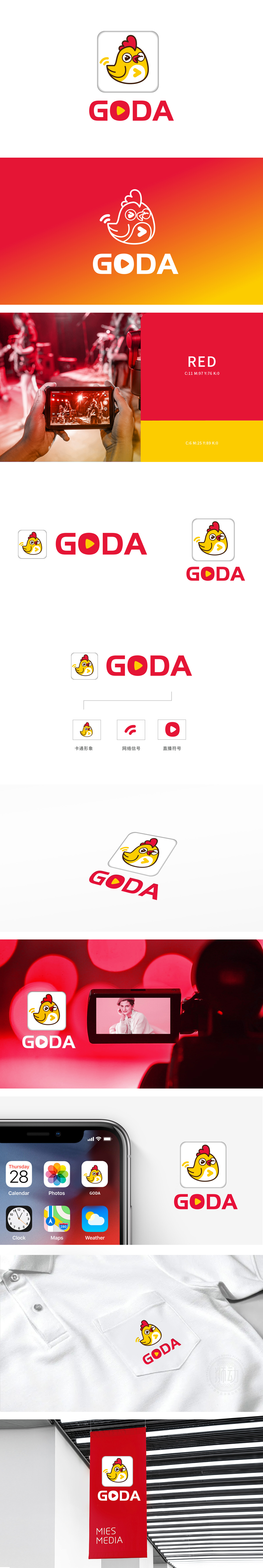
狮动设计选用卡通形象:亲和力与互动感的强化,黄色小鸡的卡通设计自带“活泼、亲切感”,符合直播场景中主播与用户的近距离互动氛围;小鸡胸前的“播放键”符号(?)直接关联“视频/直播”功能,搭配眨眼、腮红等细节,更容易让用户产生“陪伴式购物”的联想,适合吸引年轻消费群体。无论是卡通形象中的播放键、品牌名中的“O”,还是独立的直播符号,均以“?”为核心视觉基因,形成“从品牌标识到功能入口”的认知串联,用户看到任何一个符号都能联想到“GODA=直播购物”用“信号+直播”符号直白告诉用户“这是一个能看直播、信号稳定的购物平台”;精准锚定直播购物场景。
The cartoon image is selected in the lion's animation design: the affinity and interaction are strengthened, and the cartoon design of the yellow chicken has its own "lively and friendly feeling", which conforms to the close interaction atmosphere between the anchor and the user in the live broadcast scene; With details such as blinking and blushing, it is easier for users to associate with "companion shopping" and is suitable for attracting young consumers. Whether it is the play key in cartoon image, the "O" in brand name or an independent live broadcast symbol, it takes "O" as the core visual gene, forming a cognitive series from brand identity to function entrance.


扫码或拨打添加客服微信


