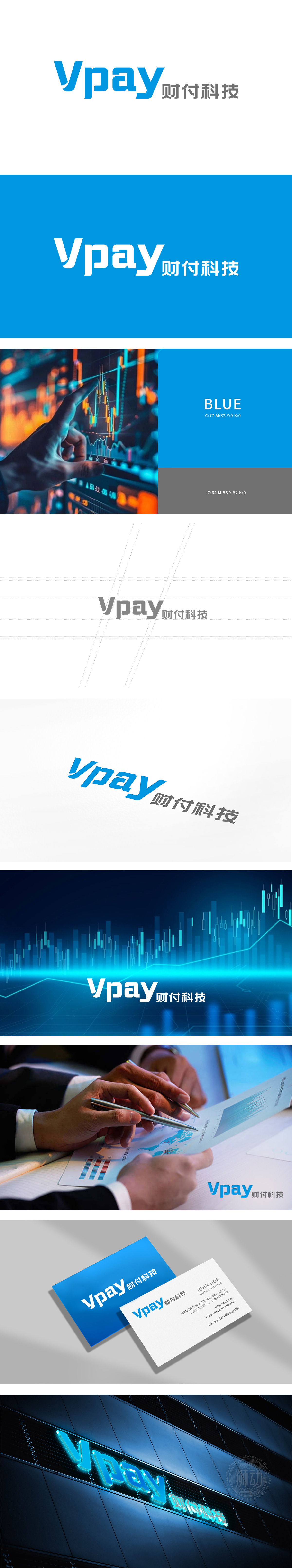
狮动设计选用无衬线字体,线条利落流畅,“V”字的倾斜角度与“p”的长腿设计,暗含“动态支付”的行业属性,同时通过字母间距的精密调控,形成视觉上的“科技秩序感”;又通过汉字结构的对称性强化了金融品牌的“规则感”与“可靠性”。饱和度较高的蓝色,瞬间建立“信任感”与“专业度”的视觉联想,符合金融行业“安全、稳定”的核心诉求;。用最简洁的视觉元素,同时传递了“传统金融的信任背书”与“现代科技的创新动能,金融质感与科技美学的融合。
Lion design uses sans serif fonts, and the lines are neat and smooth. The inclined angle of "V" and the long-legged design of "P" imply the industry attribute of "dynamic payment", and at the same time, through the precise regulation of letter spacing, a visual sense of scientific and technological order is formed. It also strengthens the "sense of rules" and "reliability" of financial brands through the symmetry of Chinese characters. The blue color with high saturation instantly establishes the visual association of "trust" and "professionalism".


扫码或拨打添加客服微信


