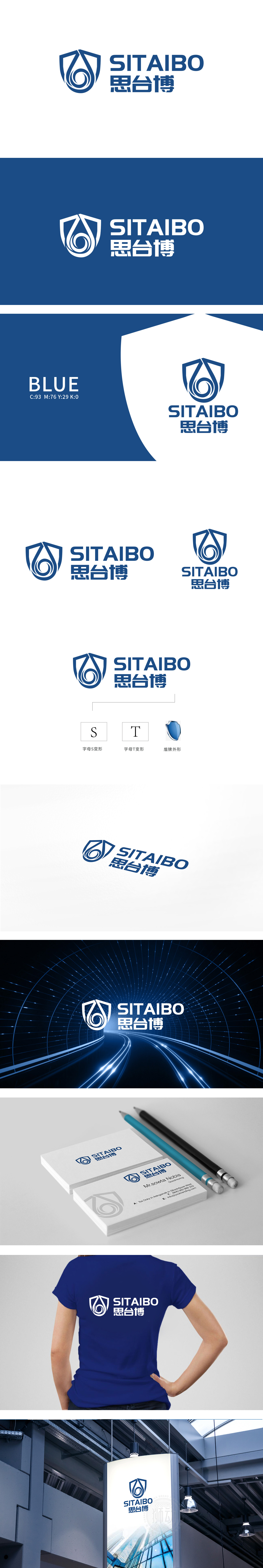
狮动设计以盾牌轮廓直观传递出安全感、可靠性,符合工业领域对“专业防护”或“技术屏障”的属性联想,为品牌奠定稳重、值得信赖的基调。字母“S”“T”的结构化融合:盾牌内部以流畅的曲线勾勒出“S”的变形,螺旋向上的线条既保留了字母的识别性,又通过动态感打破了盾牌的厚重感,隐喻“技术迭代”或“持续创新”;外部盾牌轮廓的顶部转折处巧妙融入“T”的直角结构,直线与曲线的碰撞形成刚柔并济的视觉平衡——工业设计中“功能与美学共生”的典型体现。
Lion design intuitively conveys the sense of security and reliability with the outline of shield, which accords with the attribute association of "professional protection" or "technical barrier" in the industrial field and lays a stable and trustworthy tone for the brand. The structural fusion of the letters "S" and "T": the deformation of "S" is outlined by a smooth curve inside the shield, and the spiral upward lines not only retain the recognition of the letters, but also break the heavy feeling of the shield through the dynamic sense, which means "technical iteration" or "continuous innovation".


扫码或拨打添加客服微信


