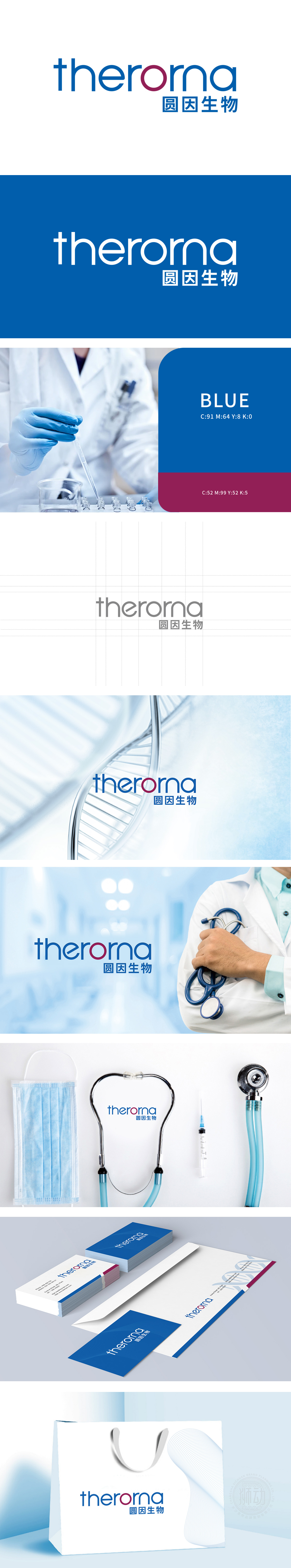
狮动设计采用主视觉“O”的核心设计:象征生命与科学,红色圆形“O”的点睛作用:在蓝色字体“therona”中,字母“O”以醒目的红色圆形突出,既打破了纯字体的单调感,又通过红色传递医疗领域中“生命力、关怀、警示”的联想;圆形形态则隐喻“完整、循环、细胞、基因螺旋”等生物学意象,与“生物科技”的企业属性高度关联。蓝色作为主体色调,常用于医疗、科技领域,传递“专业、可靠、冷静、信任感”,搭配红色的“O”形成冷暖对比,既保证了医疗行业的严谨感,又通过局部亮色增强视觉记忆点。整体风格现代而不失温度,适合医疗健康、生物科技领域对“信任感、专业性、亲和力”的综合需求。
Lion design adopts the core design of the main vision "O": symbolizing life and science.The finishing touch of the red circle "O": in the blue font "therona", the letter "O" stands out with a striking red circle, which not only breaks the monotony of the pure font, but also conveys the association of "vitality, care and warning" in the medical field through red; The circular shape is a metaphor for biological images such as "integrity, cycle, cell and gene spiral", which is highly related to the enterprise attribute of "biotechnology". As the main color tone, blue is often used in medical and scientific fields, conveying "professionalism, reliability, calmness and trust".


扫码或拨打添加客服微信


