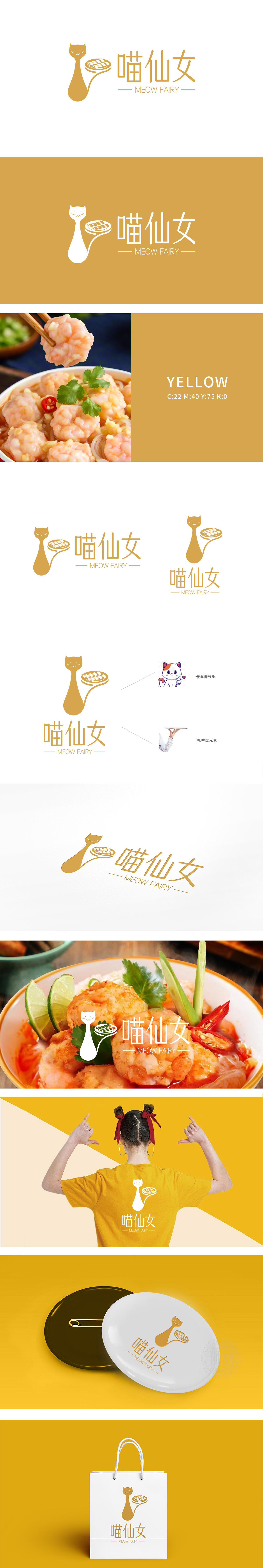
狮动设计以抽象化的猫咪轮廓为主体,头部简化为微笑弧线,身体自然延伸为“托举托盘”的动态,既保留了猫咪的软萌特质,又通过“托举”动作直观传递“餐饮服务”的核心场景,“喵”直接关联猫咪形象,“仙女”则赋予品牌温柔、精致的调性,与猫咪微笑的神态、优雅的托举姿态形成呼应,塑造出“亲切又美好的美食传递者”人设,比传统餐饮品牌名更有情感温度。暖金色主色调传递温暖、食欲感,保持“仙女”的优雅感,整体视觉既活泼又不失质感。
Lion design takes the abstract outline of the cat as the main body, the head is simplified as a smiling arc, and the body naturally extends to the dynamic of "lifting the tray", which not only retains the soft and cute characteristics of the cat, but also intuitively conveys the core scene of "catering service" through the "lifting" action. "Meow" is directly related to the image of the cat, and "Fairy" gives the brand a gentle and exquisite tonality, echoing the smiling expression and elegant lifting posture of the cat. The warm gold main color conveys warmth and appetite, maintains the elegance of "fairy", and the overall vision is lively without losing texture.


扫码或拨打添加客服微信


