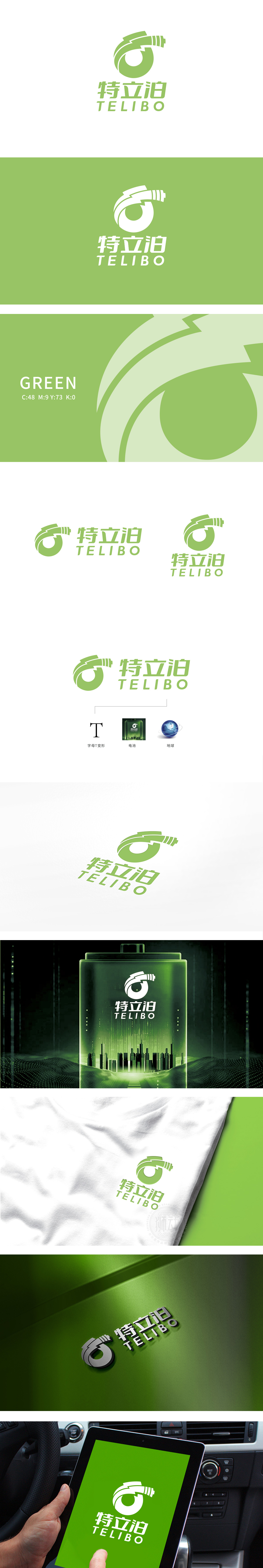
狮动设计以绿色为主色调,整体轮廓从品牌首字母“T”出发,通过流畅的曲线和“能量流动感”的设计,打破了字母的静态感:环形包裹:象征“循环、可持续”,暗合电池能源的绿色环保属性;闪电纹与箭头趋势:传递“动力、效率、科技感”,绿色主色调:不仅传递“环保、新能源”的理念,也可能关联电池技术中“低能耗、长续航”的属性;实现了从符号到认知的高效传递 。
Lion design takes green as the main color, and the overall outline starts from the initial letter "T" of the brand. Through the design of smooth curve and "energy flow sense", the static feeling of the letter is broken: the circular package symbolizes "circulation and sustainability", which coincides with the green environmental protection attribute of battery energy; Lightning stripes and arrow trends: convey the sense of power, efficiency and technology; green main color: not only convey the concept of "environmental protection and new energy".


扫码或拨打添加客服微信


