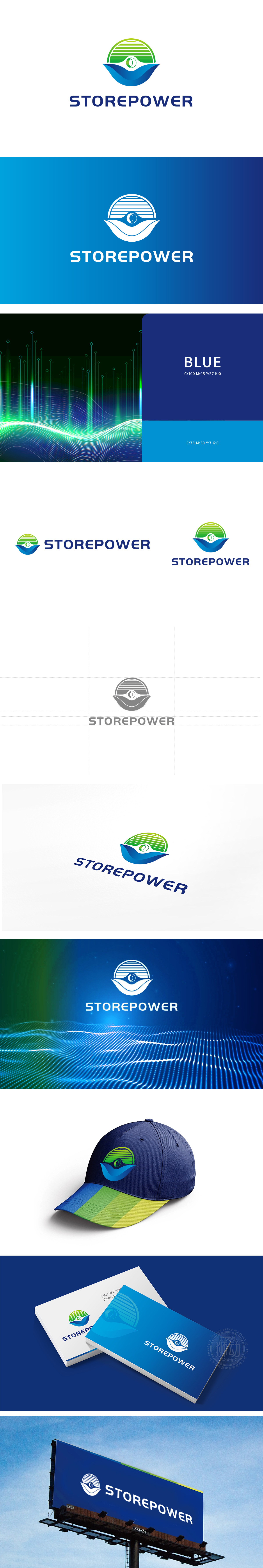
狮动设计采用绿色“扇形”造型,既像太阳能板的排列结构,也暗合风力发电机的叶片意象,直接关联可再生能源的核心来源;蓝色“波浪”形态,既呼应“储能”的“存储”功能,也暗示能源的流动性与稳定性,整体形成“能源吸收-转化-存储”的视觉闭环。“STOREPOWER”的文字设计:英文名称直白传递“储能”核心业务,字体选用稳重的无衬线体,蓝色主调强化专业感与可靠性,与能源行业对“安全”“高效”的诉求高度契合绿色象征可持续能源,蓝色代表清洁能源或科技感,二者渐变过渡既符合“能源”的环保属性,又传递出“绿色科技”的品牌定位。整体通过“色彩-符号-文字”的三重协同,将“储能”行业的核心要素浓缩为高度概括的视觉语言,做到了行业属性的精准识别。
Lion design adopts green "fan" shape, which is not only like the arrangement structure of solar panels, but also coincides with the blade image of wind turbines, and is directly related to the core source of renewable energy; The blue "wave" shape not only echoes the "storage" function of "energy storage", but also implies the fluidity and stability of energy, forming a visual closed loop of "energy absorption-transformation-storage" as a whole. The text design of "STOREPOWER": the English name directly conveys the core business of "energy storage", the font is selected with stable sans serif, and the blue main tone strengthens the sense of professionalism and reliability, which is highly consistent with the demands of the energy industry for "safety" and "efficiency".


扫码或拨打添加客服微信


