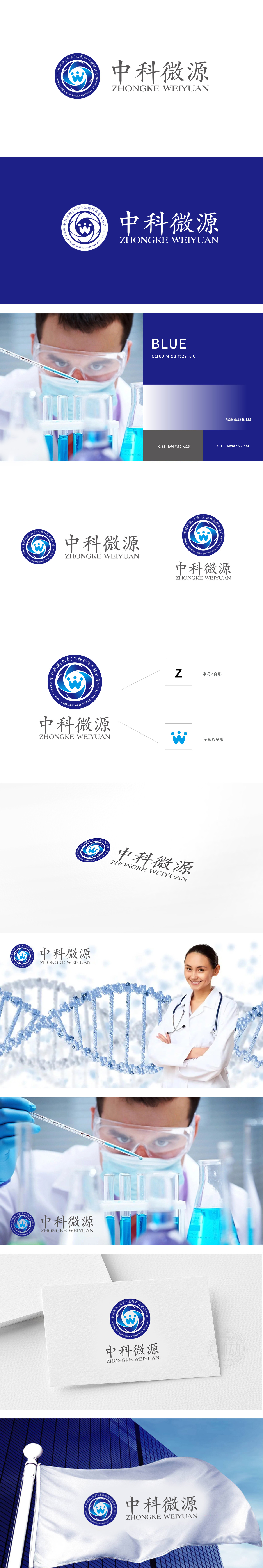
狮动设计采用蓝色环形结构,内嵌三个抽象“人形”线条(类似手拉手的几何化处理),既呼应了生物科技领域常用的“生命循环”“细胞结构”意象,又通过环形的封闭感传递出“专注、严谨”的科研态度。蓝色作为医疗、科技行业的经典色,强化了理性、专业的品牌调性,中科微源的标志通过“图形隐喻业务属性”“色彩强化行业认知”“布局传递专业感”的三重设计逻辑,成功将“生物科技”“医疗服务”“精准分析”等核心信息浓缩为可感知的视觉语言。
Lion design adopts blue ring structure and embeds three abstract "humanoid" lines (similar to hand-in-hand geometric treatment), which not only echoes the images of "life cycle" and "cell structure" commonly used in the field of biotechnology, but also conveys a "dedicated and rigorous" scientific research attitude through the sense of ring closure. As a classic color in medical and scientific industries, blue strengthens the rational and professional brand tonality.


扫码或拨打添加客服微信


