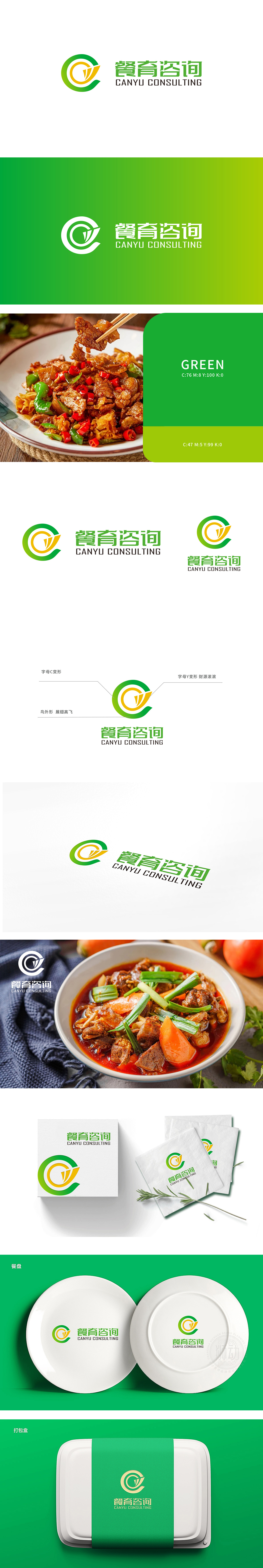
狮动设计以字母“C”为基底,通过流畅的环形结构包裹内部的“Y”形元素,既直观体现品牌名称“餐育”,又用环形的“包容感”象征咨询服务的“全方位支持”,而“Y”形像生长的枝叶或向上的箭头,传递“培育、赋能、成长”的品牌定位,与“咨询”的核心价值(助力餐饮企业发展)高度契合。绿色环形轮廓搭配黄色内芯,绿色既呼应餐饮行业的“健康、新鲜、天然”属性,也传递“可持续发展”的理念;黄色则象征“活力、财富、专业”,与“财源滚滚”的注解形成呼应,同时整体图形抽象为“展翅高飞的鸟”,强化“助力餐饮企业腾飞”的愿景,赋予品牌积极向上的精神内核。整体以“轻符号、重寓意”的方式,将“餐饮行业属性”、“咨询服务价值”、“品牌愿景”浓缩于极简图形中,构建了“专业、活力、值得信赖”的品牌形象。
Lion design is based on the letter "C" and wraps the Y-shaped elements inside through a smooth ring structure, which not only intuitively reflects the brand name "Meal Education", but also symbolizes the "all-round support" of consulting service with a ring-shaped "sense of tolerance", and the Y-shaped image conveys the brand positioning of "cultivating, empowering and growing" and "consulting" Green circular outline with yellow core, green not only echoes the "healthy, fresh and natural" attribute of catering industry, but also conveys the concept of "sustainable development"; Yellow symbolizes "vitality, wealth and professionalism", which echoes the annotation of "rolling financial resources". At the same time, the overall graphics are abstracted as "birds flying high".


扫码或拨打添加客服微信


