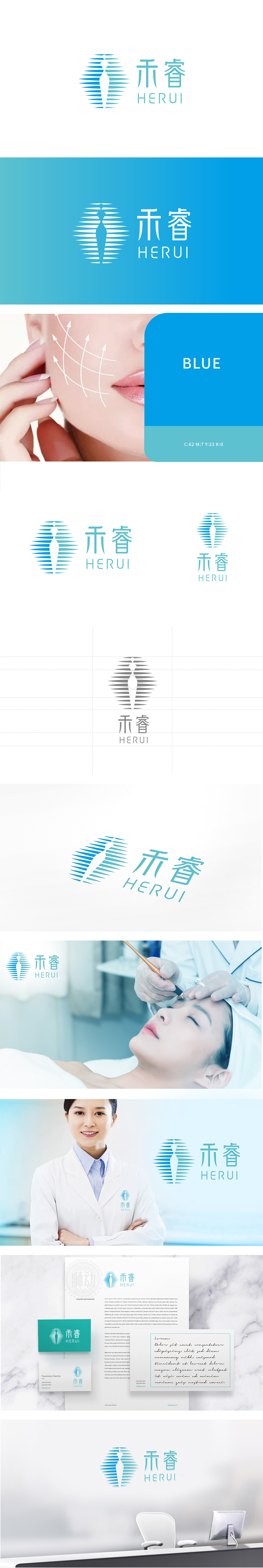
狮动设计将蓝白渐变的放射状线条为主体,线条从中心向外扩散,既直观呈现了“光子”的能量传播形态,又通过渐变色彩(传递出“温和、精准、可控”的技术特性,线条排列整齐有序,隐含“专业、严谨”的医疗服务属性,平衡了“科技医疗”与“美容护理”的双重定位。放射线条的中心巧妙勾勒出一个抽象的女性侧身轮廓,传递出“科技赋能美丽”的品牌主张。轮廓线条简洁柔和,既体现美容行业的“柔美”特质,又通过直立的姿态展现“自信、优雅”的用户画像,增强情感共鸣。“禾睿”的品牌标识通过“具象符号+ 抽象隐喻+ 理性配色”的组合,成功实现了“医疗科技”与“美容服务”的视觉融合。
Lion Design takes the radial lines with gradual changes of blue and white as the main body, and the lines spread outward from the center, which not only intuitively presents the energy transmission form of "photon", but also conveys the technical characteristics of "gentleness, accuracy and controllability" through gradual colors. The lines are arranged in an orderly way, implying the medical service attributes of "professionalism and preciseness" and balancing the dual positioning of "scientific medical treatment" and "beauty care".The center of the radial line cleverly outlines an abstract female profile, conveying the brand proposition of "technology empowers beauty".


扫码或拨打添加客服微信


