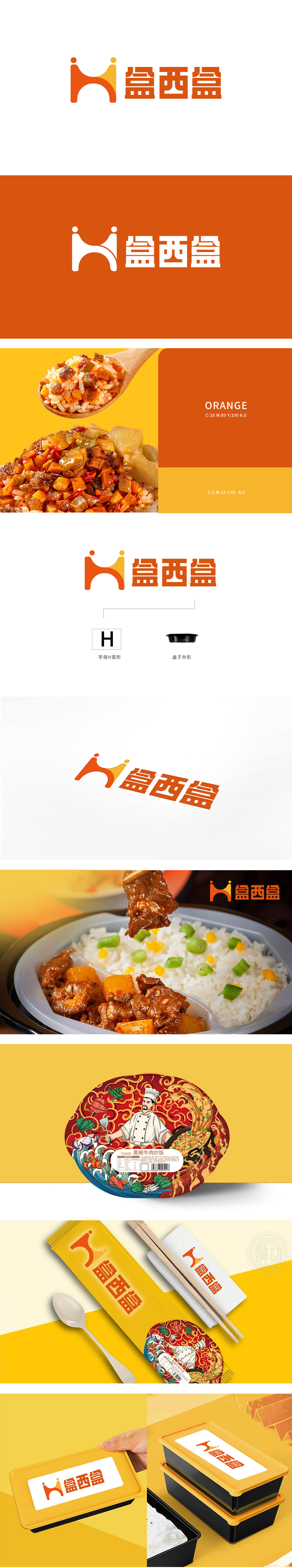
狮动设计以字母 “H” 为核心,双弧形线条 巧妙模拟了“盒子开口”的轮廓,同时上下两端的圆点像是两人头部的抽象化,暗合食品消费中“分享”“陪伴”的场景。橙色到黄色的渐变 既传递出食品行业的温暖、活力感,又通过色彩分层让图形更具立体感,避免了纯字母的单调。 这种设计既保留了字母的识别性,又通过形态联想赋予了“盒子”和“人文”的双重含义,实现了 “符号即品牌” 的记忆点。用最简洁的图形,讲清楚品牌的“身份”和“温度”。
Lion design takes the letter "H" as the core, and the double arc lines skillfully simulate the outline of the "box opening". At the same time, the dots at the upper and lower ends are like the abstraction of the heads of two people, which coincides with the scene of "sharing" and "companionship" in food consumption. The gradual change from orange to yellow not only conveys the warmth and vitality of the food industry, but also makes the graphics more stereoscopic through color stratification, avoiding the monotony of pure letters.


扫码或拨打添加客服微信


