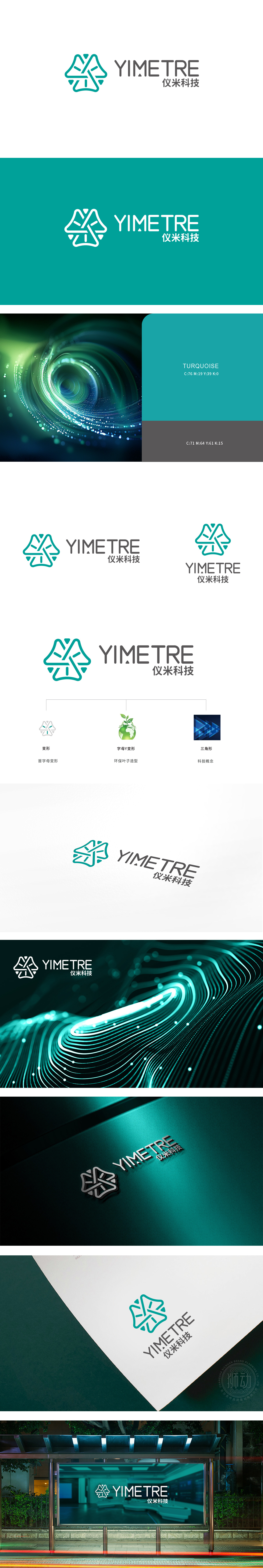
狮动设计以“YIMETRE”首字母“Y”为原型,通过对称的几何线条(绿色描边)构建出类似“X”与“Y”抽象形态,传递科技行业的精准、前沿属性。线条的闭合与开放结构,则暗示“连接数据”与“开放创新”的理念。色彩与图形的行业符号化,绿色作为主色调,既通过“仪米科技”中文名传递“精密如仪、生长如米”的隐喻,“仪米”的“米”关联自然生长,绿色与之呼应;“仪”关联精密仪器,几何线条的严谨性匹配这一特质,实现了“名称-图形-行业”的语义闭环。
Lion esign takes the initial "Y" of "YIMETRE" as the prototype, and constructs abstract forms similar to "X" and "Y" through symmetrical geometric lines (green strokes) to convey the precision and cutting-edge attributes of the technology industry. The closed and open structure of lines implies the concepts of "connecting data" and "open innovation". The industry symbolization of color and graphics, with green as the main color, not only conveys the metaphor of "precision as instrument and growth as meter" through the Chinese name of "Yimi Technology", but also the "meter" of "Yimi Technology" is associated with natural growth, and green echoes it.


扫码或拨打添加客服微信


