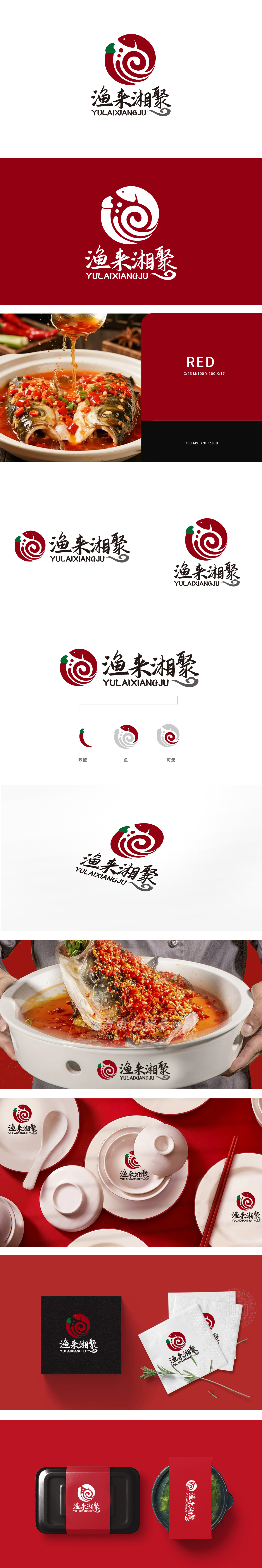
狮动设计把「辣椒、鱼、河流」三个关键符号揉进一个圆形标识,辣椒用绿色蒂头+红色弯弧点睛,既保留食材辨识度,又化作螺旋纹的「起点」;渔」与「鱼」:直接用鱼形符号呼应核心食材,强化「以鱼为鲜」的定位;河流则通过渐变的漩涡线条体现,既像水流涌动,又和辣椒的红色形成「热辣与鲜活」的对比,暗合湘菜「鲜辣交融」的特点。整体设计让品牌不止是餐厅,更像「因美食相聚的港湾」。
Lion design rubs three key symbols of "pepper, fish and river" into a circular logo, and the pepper is finished with green pedicle and red curved arc, which not only retains the recognition of ingredients, but also becomes the "starting point" of spiral pattern; Fishing and fish: directly use fish-shaped symbols to echo the core ingredients, and strengthen the positioning of "taking fish as fresh"; The river is reflected by the gradually changing vortex lines, which is not only like the surging water, but also forms a "hot and lively" contrast with the red pepper.


扫码或拨打添加客服微信


