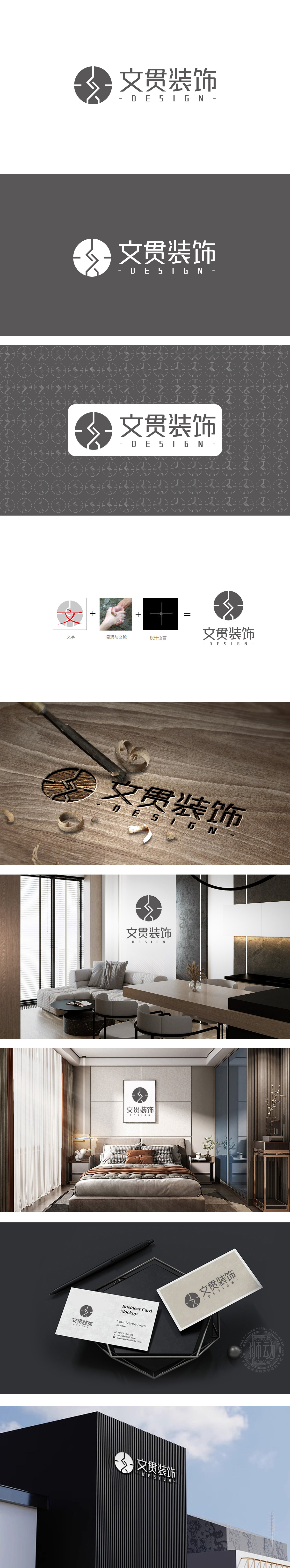
狮动设计以“文”字作为品牌核心符号,如同中式装饰中的“文化锚点”,以文字承载品牌精神,与中式设计“以形表意”的逻辑一致。圆形为基底,既延续了中式美学对“圆”的偏好,又通过内部线条分割形成“方与圆”的对比,暗合中式装饰“刚柔并济”的空间哲学。“握手”意象,恰如中式空间中“人与空间”“空间与空间”的对话关系——既独立又关联,体现“贯通”的核心诉求。LOGO中的十字网格如同中式装饰的“隐形骨架”,整体设计以几何秩序统合文化符号,体现“传统意境”与“现代设计逻辑”的结合图形将“文”(文化)、“贯”(贯通)、“设计”(结构)三者融为一体,如同中式装饰中“器以载道”的理念——不仅追求视觉美感,更注重通过符号、结构、空间关系传递深层文化内涵。
Lion design takes the word "Wen" as the core symbol of the brand, just like the "cultural anchor point" in Chinese decoration, and carries the brand spirit with words, which is consistent with the logic of "expressing meaning with form" in Chinese design. Based on the circle, it not only continues the preference of Chinese aesthetics for "circle", but also forms the contrast of "square and circle" through the division of internal lines, which coincides with the spatial philosophy of "combining rigidity with flexibility" in Chinese decoration. The image of "handshake" is just like the dialogue relationship between "man and space" and "space and space" in Chinese space-both independent and related, reflecting the core appeal of "communication". The cross grid in LOGO is like the "invisible skeleton" of Chinese decoration. The overall design integrates cultural symbols with geometric order, which embodies the combination of "traditional artistic conception" and "modern design logic". The graphics integrate "culture".


扫码或拨打添加客服微信


