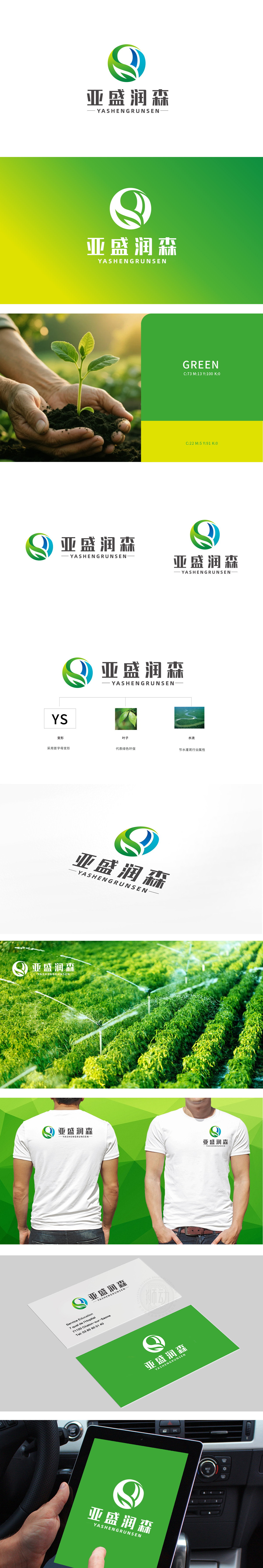
狮动设计以绿色为主色调,核心图形由 “叶子”“水流” 两大自然符号与 “YS”首字母变形 结合:将品牌名称“亚盛”的拼音首字母“Y”和“S”进行流畅曲线化处理,融入环形结构中,既保留了品牌识别性,又通过柔和的线条模拟自然形态,避免机械感。叶子元素:象征植物、生态与绿色环保,叶片边缘的弧度与水流线条自然衔接,强化“人与自然共生”的视觉联想。绿色(自然、环保)与蓝色(科技、水元素)的搭配,既符合大众对“绿色农业”“节水技术”的色彩认知,又通过渐变过渡增强视觉层次感,传递品牌在环保领域的创新力。整体设计传递出“科技赋能绿色农业,节水守护生态未来”的品牌形象。
Lion design takes green as the main color, and the core graphics are combined by the two natural symbols of "leaf" and "water flow" and the initials of "YS": the pinyin initials "Y" and "S" of the brand name "Yasheng" are smoothly curved and integrated into the ring structure, which not only retains the brand recognition, but also simulates the natural form through soft lines to avoid mechanical feeling. Leaf element: it symbolizes plants, ecology and green environmental protection. The radian of the leaf edge is naturally connected with the water flow line, which strengthens the visual association of "symbiosis between man and nature". The combination of green (nature, environmental protection) and blue (technology, water element) not only conforms to the public's color cognition of "green agriculture" and "water saving technology".


扫码或拨打添加客服微信


