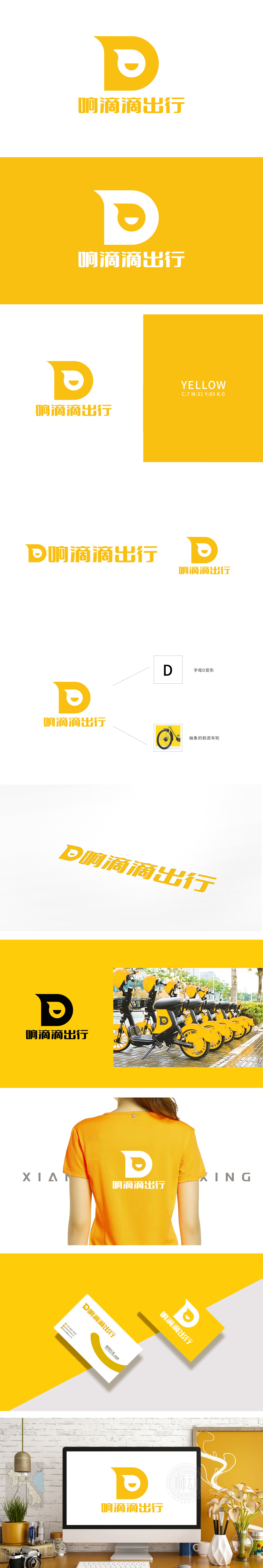
狮动设计以黄色“D”为基础框架,线条自然延伸成上扬的“喇叭”形态(呼应“响”字的声音联想),白色负空间巧妙构成了“抽象的前进车轮”,与“出行”场景高度契合。这种“以简驭繁”的设计,让视觉符号自带功能联想。明黄色作为主色调,既符合出行工具的高辨识度需求,又传递出活力、便捷的品牌调性;搭配黑色文字“响滴滴出行”,形成清晰的信息层级,整体简洁易记,适合多场景应用。
Lion design is based on the yellow "D", and the lines naturally extend into the rising "trumpet" shape (echoing the sound association of the word "ring"), and the white negative space cleverly constitutes the "abstract forward wheel", which is highly consistent with the "trip" scene. This design of "controlling complexity with simplicity" makes visual symbols have their own functional associations. Bright yellow, as the main color, not only meets the needs of high recognition of travel tools, but also conveys vitality and convenient brand tonality.


扫码或拨打添加客服微信


