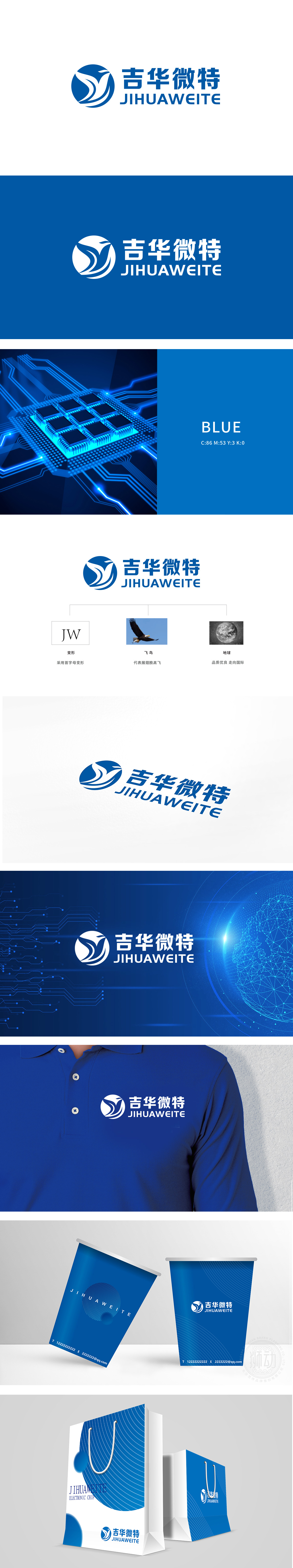
狮动设计采用首字母“JW”抽象为流畅的飞鸟形态,既保留了字母的识别性,又通过线条的动态感赋予图形生命力,体现了设计的凝练与巧思。飞鸟意象的象征:展翅的飞鸟不仅呼应了“展翅膀高飞”的品牌愿景,蓝色调的运用(天空、科技感)与流线型轮廓也传递出企业的活力与前瞻性,视觉上轻盈且富有力量感。整体将首字母变形(品牌基因)→ 飞鸟(成长与突破)→ 地球(国际视野),层层递进地诠释了“从立足根本到走向全球”的发展路径。
Lion design takes the initial letter "JW" as a smooth bird form, which not only retains the recognition of letters, but also gives vitality to graphics through the dynamic sense of lines, which embodies the conciseness and ingenuity of design. Symbol of the image of flying birds: The flying birds not only echo the brand vision of "spreading their wings and flying high", but also convey the vitality and foresight of the enterprise with the use of blue tones (sky and sense of technology) and streamlined outline.


扫码或拨打添加客服微信


