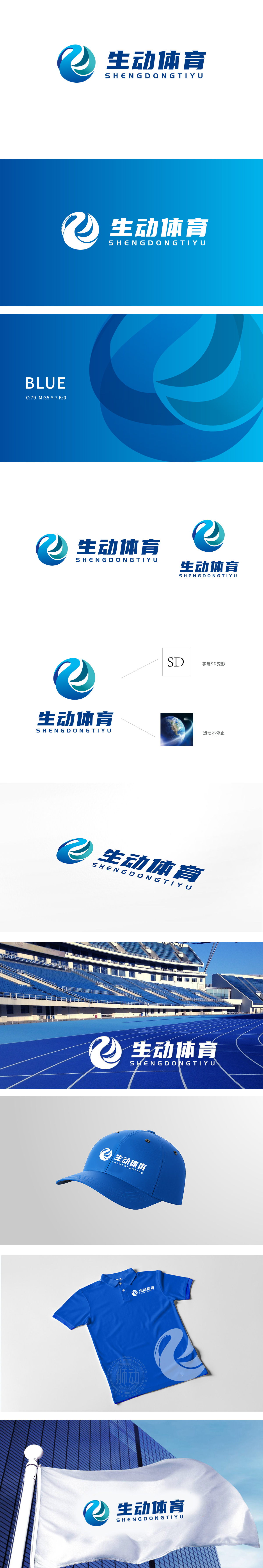
狮动设计以蓝绿色渐变的环形流线构成,整体呈旋转上升的动态感,既像抽象化的“字母SD”变形,形成视觉记忆点;又暗含“运动轨迹”的意象,流动的线条仿佛运动员的肢体舒展、球类运动的旋转轨迹,或赛道的延伸,完美呼应“体育 运动永不停歇”的核心属性。色彩上,深海蓝与活力青的渐变既传递科技感,又通过冷暖色对比增强视觉张力,象征运动的激情与专业。整个LOGO以“SD”为核心基因,通过“流动曲线+地球意象”的组合,既完成了品牌名称的视觉化表达,又将“体育”的动感、“生动”的活力、“全球”的视野三重维度浓缩其中。
Lion design is composed of a gradual blue-green circular streamline, which shows a dynamic sense of rotating and rising as a whole, which is not only like the abstract "SD" deformation, but also forms a visual memory point; It also implies the image of "sports track". The flowing lines are like the stretching of athletes' limbs, the rotating track of ball games, or the extension of the track, which perfectly echoes the core attribute of "sports never stop". In color, the gradual change of deep blue and vibrant green not only conveys the sense of science and technology, but also enhances the visual tension through the contrast of cold and warm colors, symbolizing the passion and professionalism of sports.


扫码或拨打添加客服微信


